Works
Works
A glimpse, not the whole story. Each project here is a small piece of the actual work — enough to show the range. Curious about the rest? Just ask.

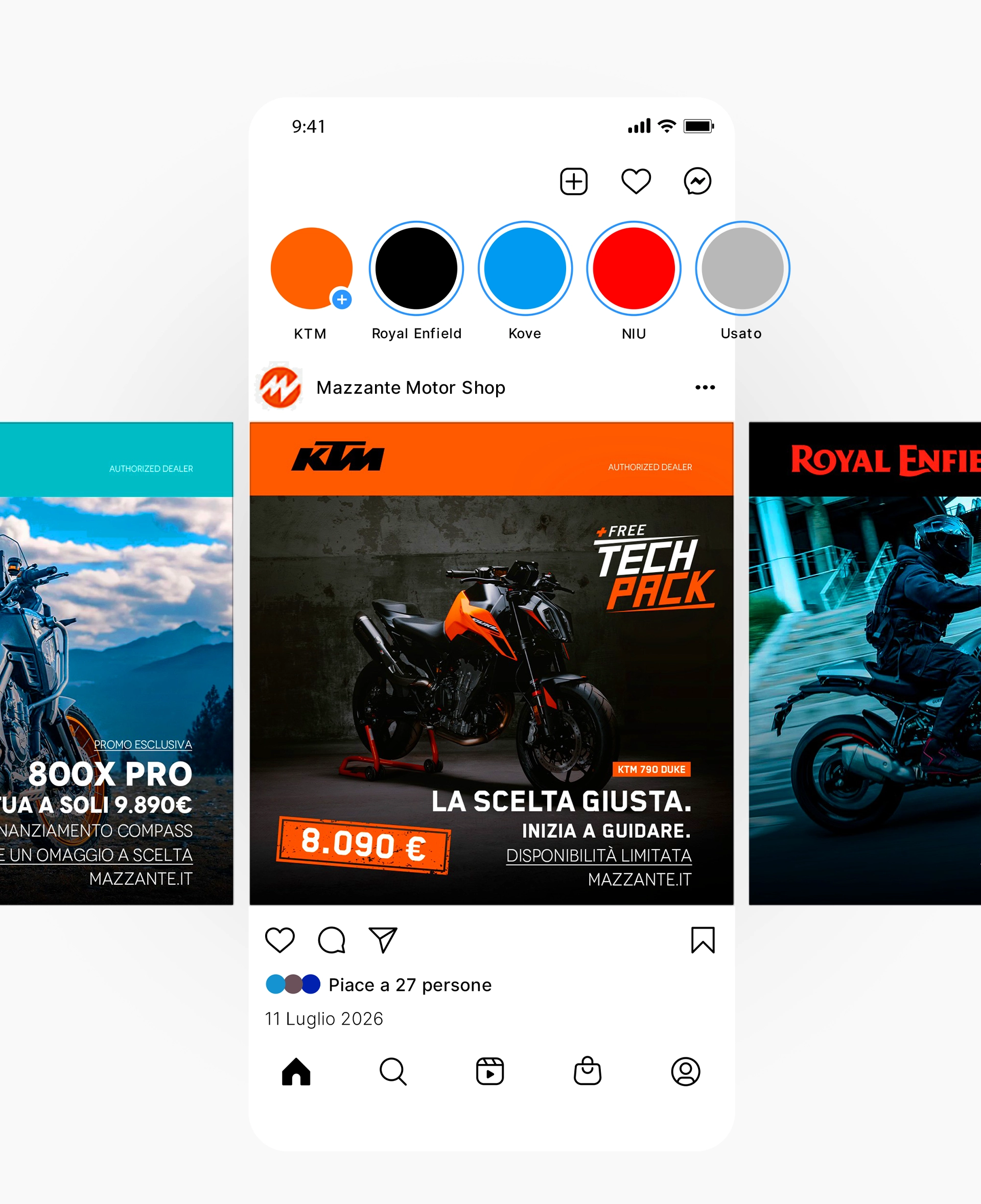
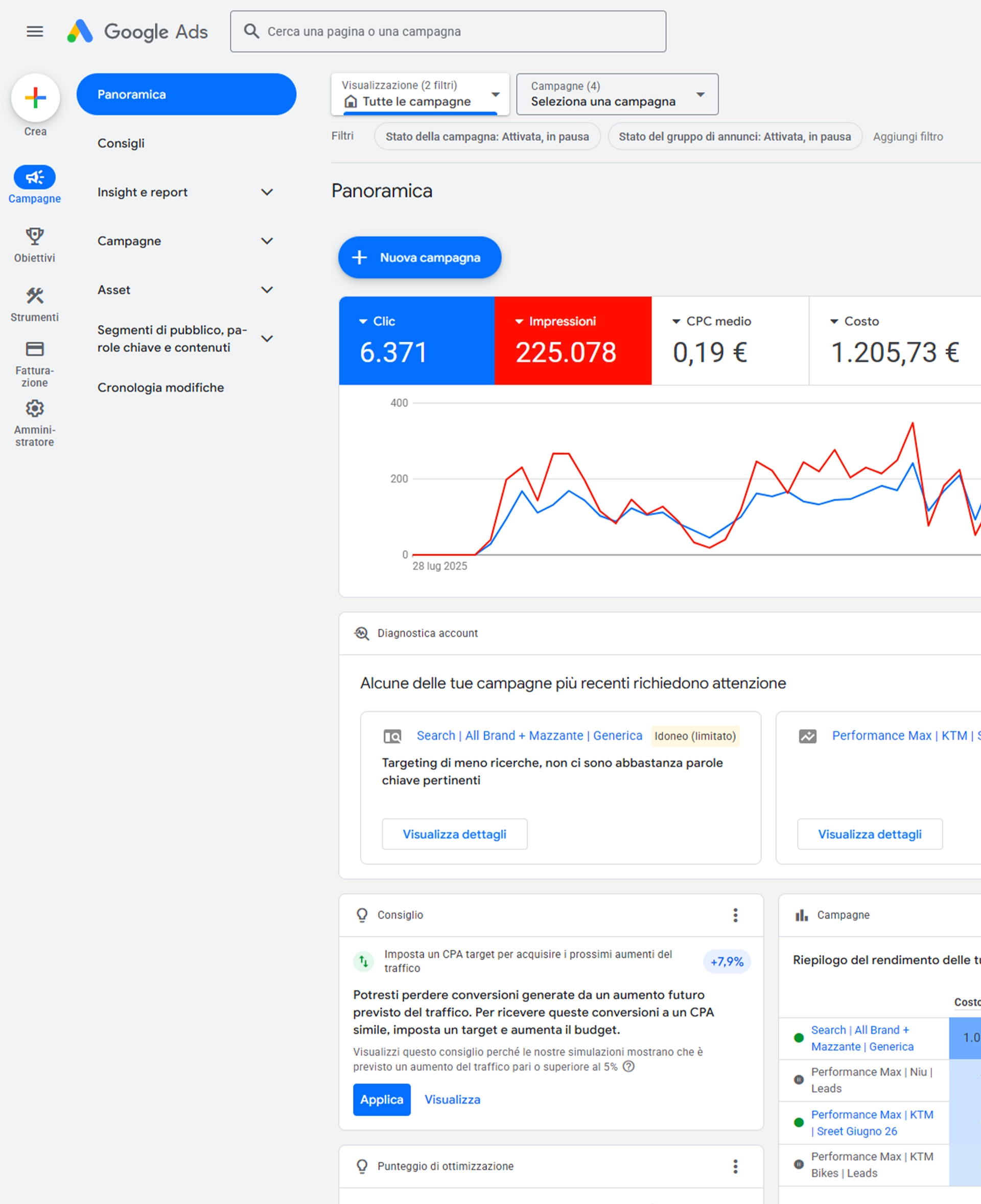
Mazzante Motor Shop
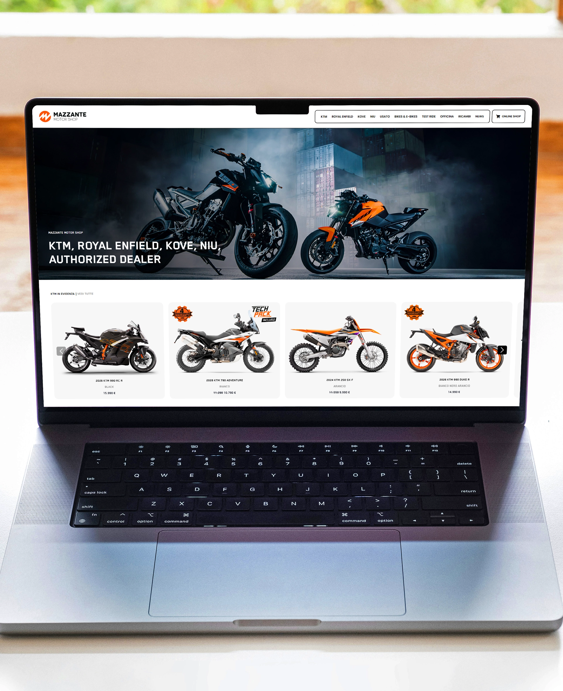
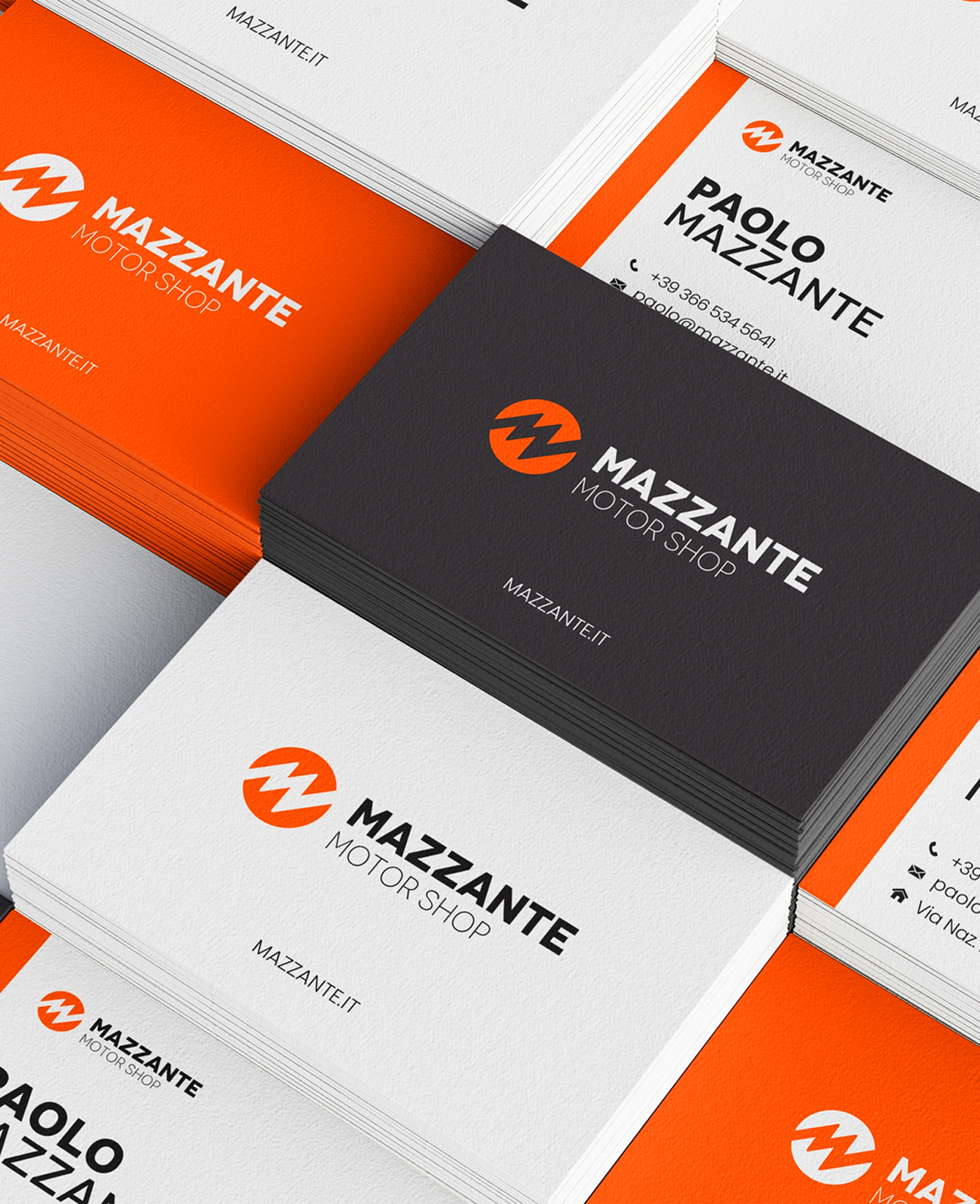
A dealership's showroom needed a digital counterpart just as easy to browse. The work covered the full picture — a showcase website supported by SEO to bring the right visitors in, ongoing social media management to keep the brand present, and a CRM to turn interest into relationships.

Laplandia Water
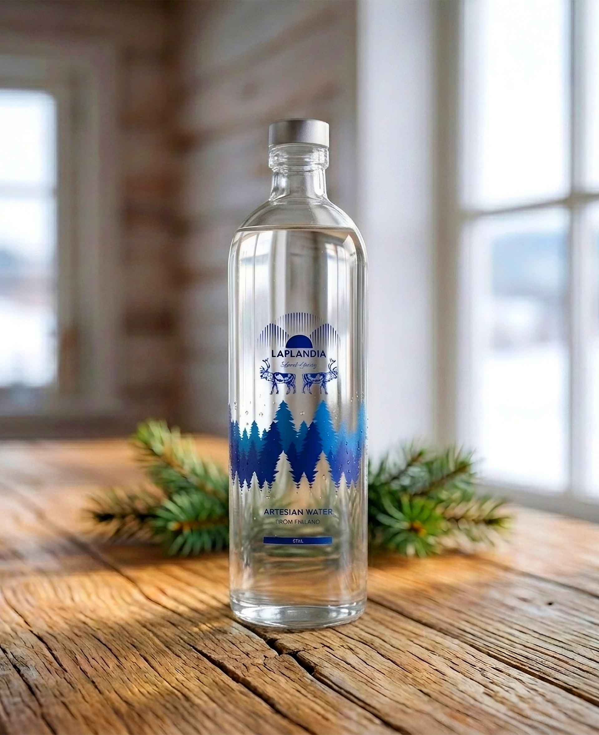
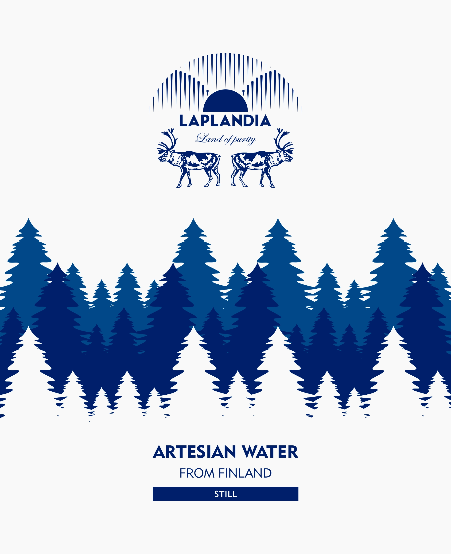
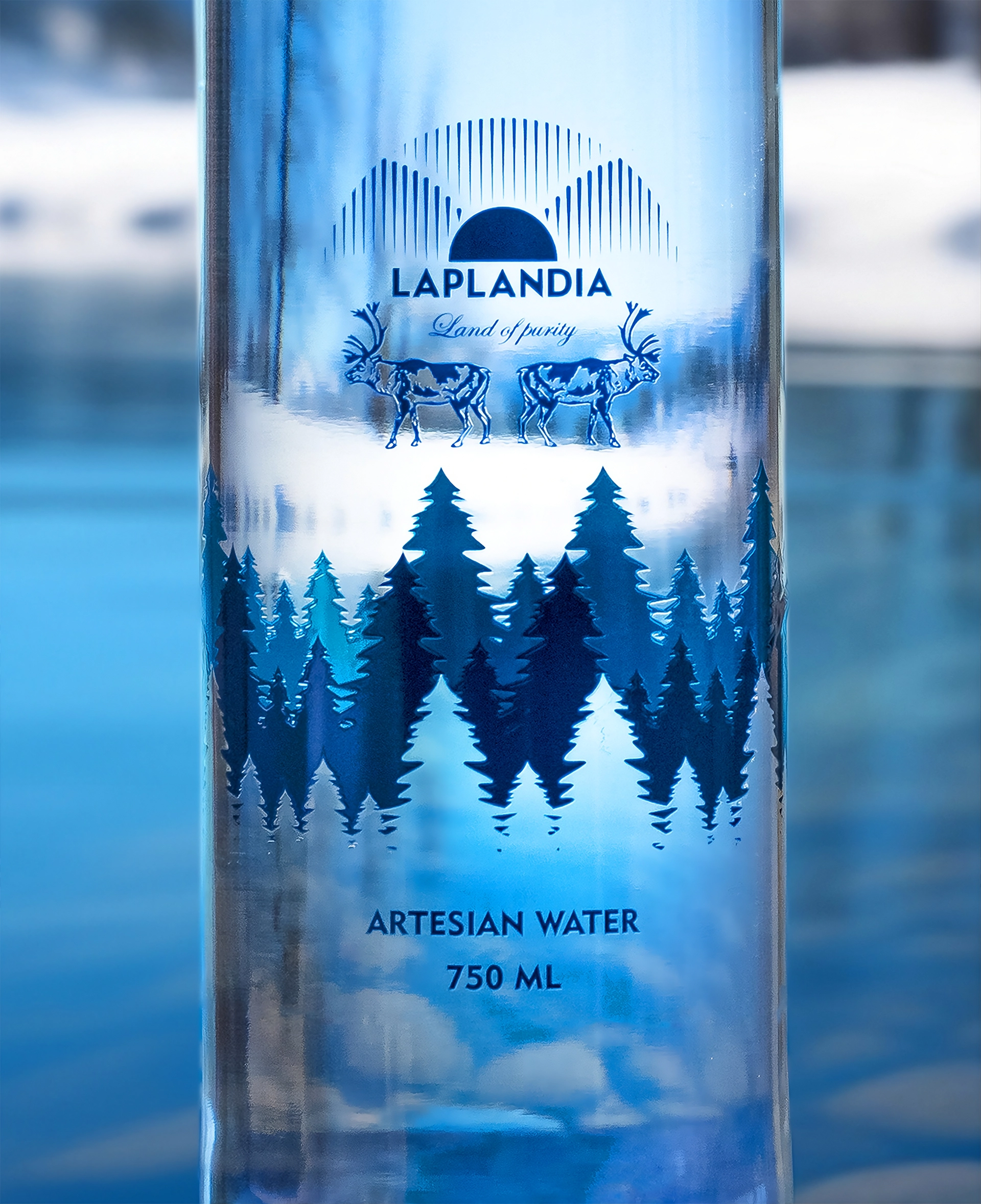
Somewhere between Nordic minimalism and the idea of water so pure it barely needs a story, this identity leans into restraint. Clean lines, cold tones, and just enough visual language to let the origin speak for itself.
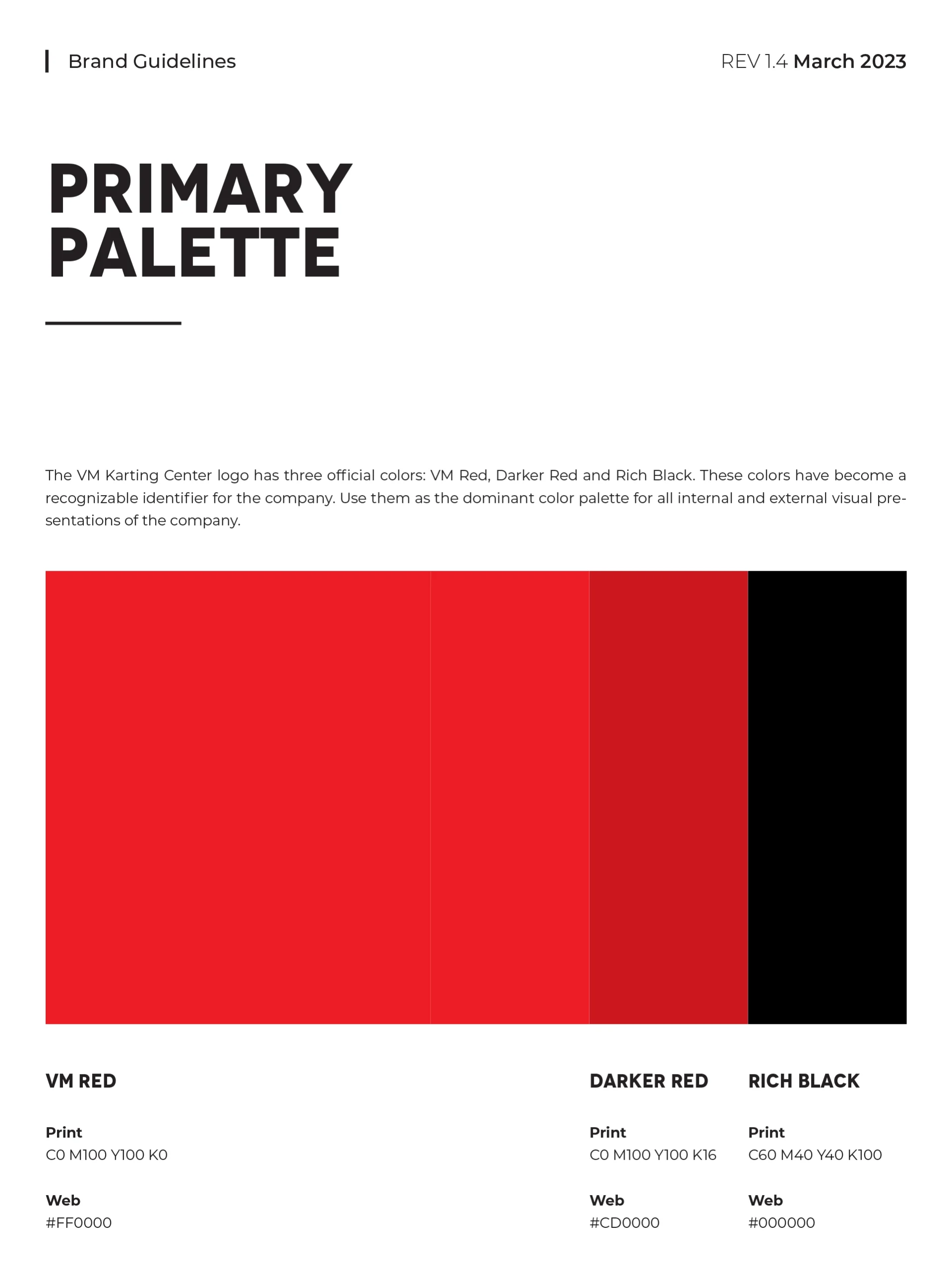
VMKC Branding
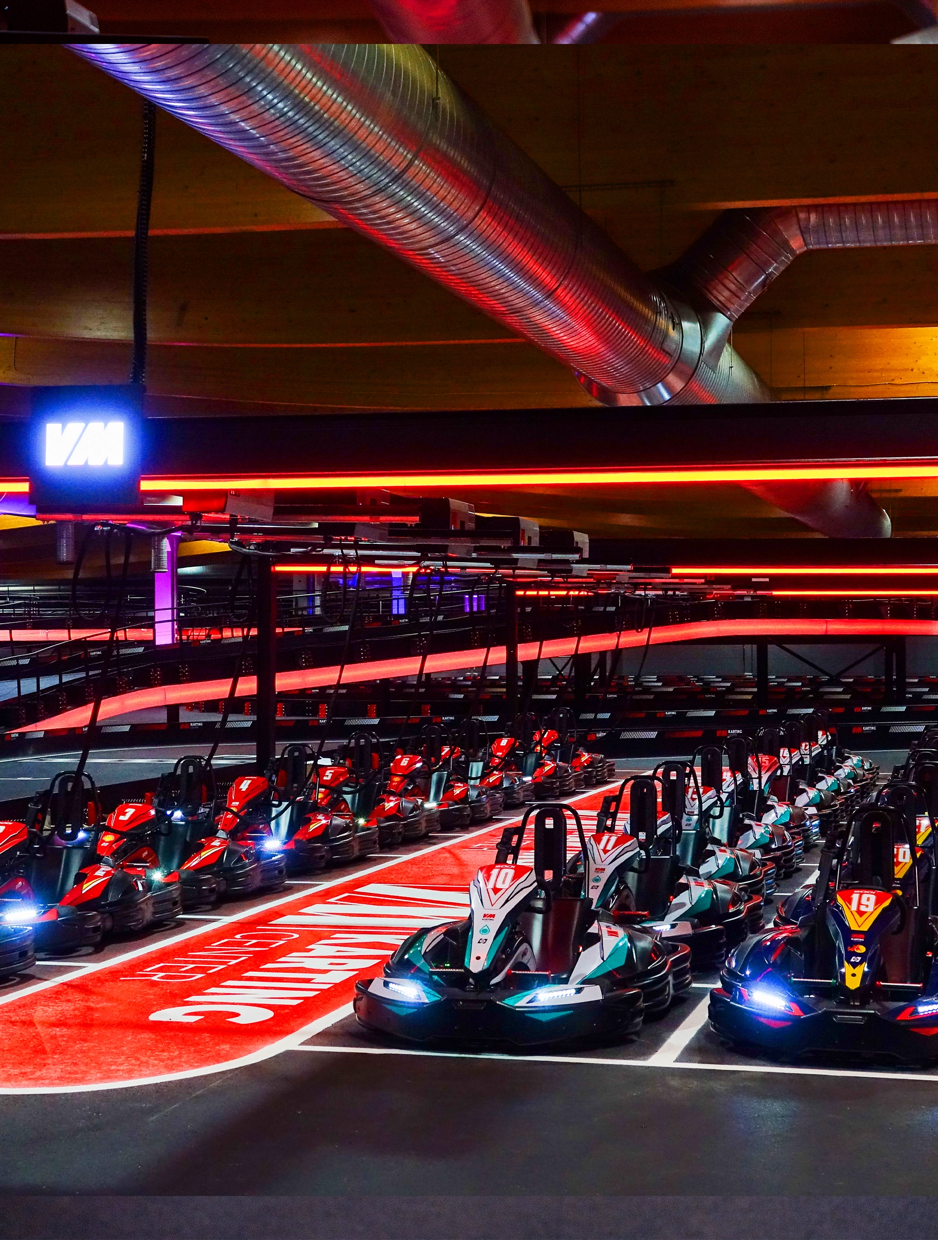
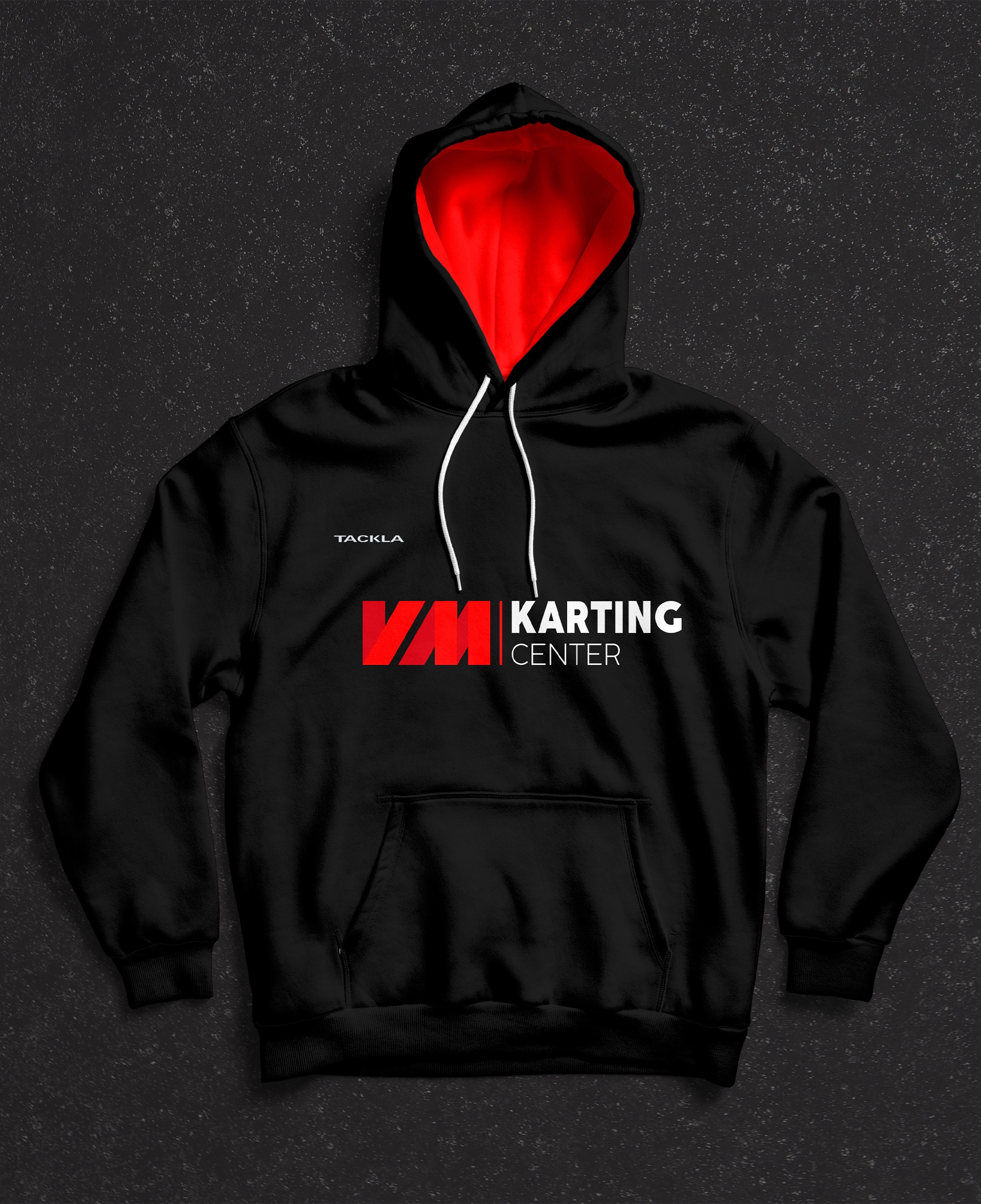
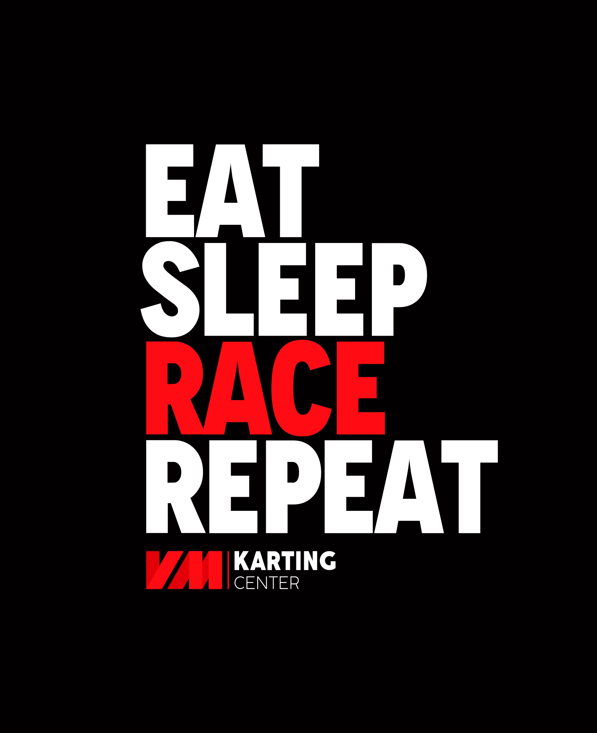
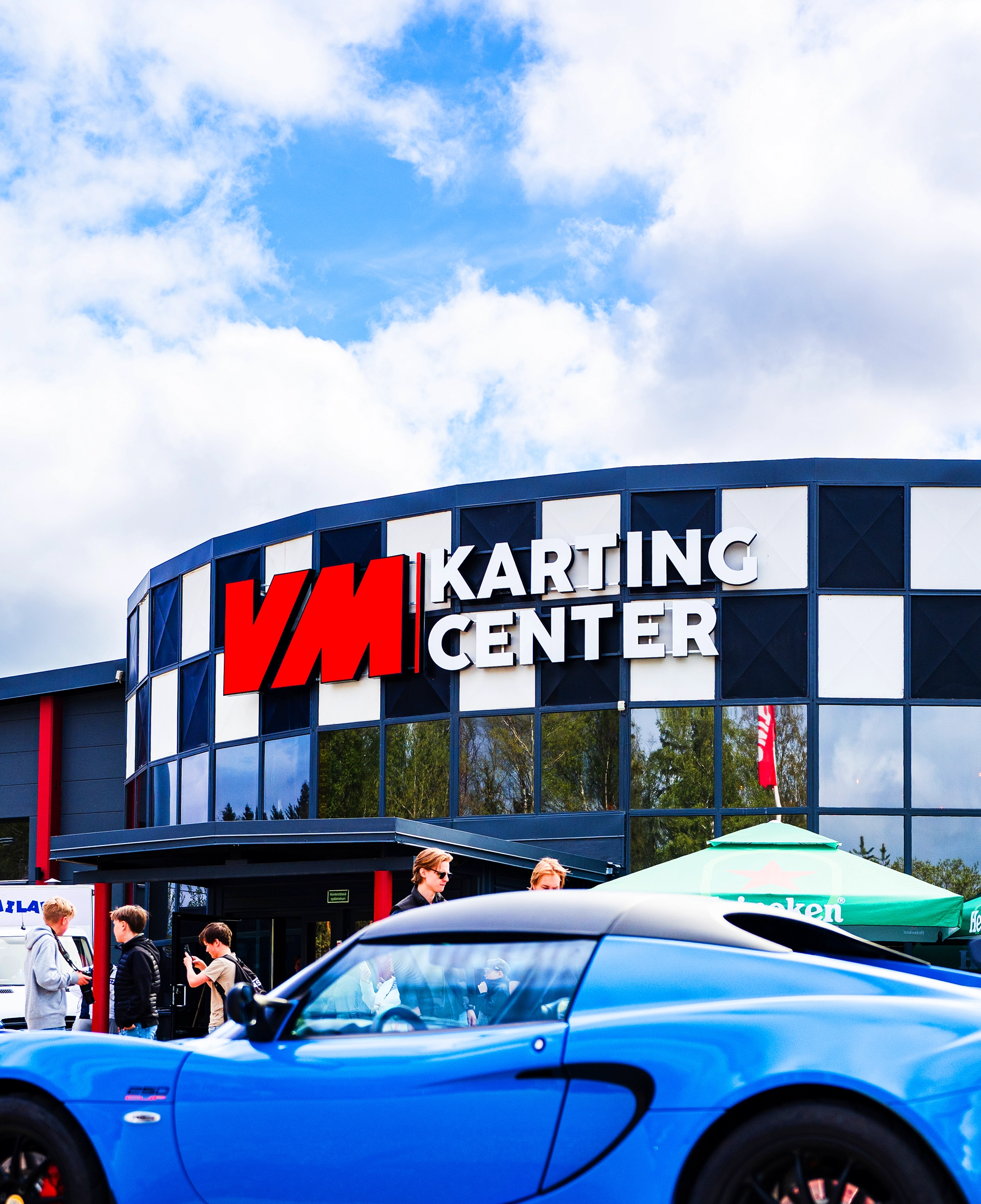
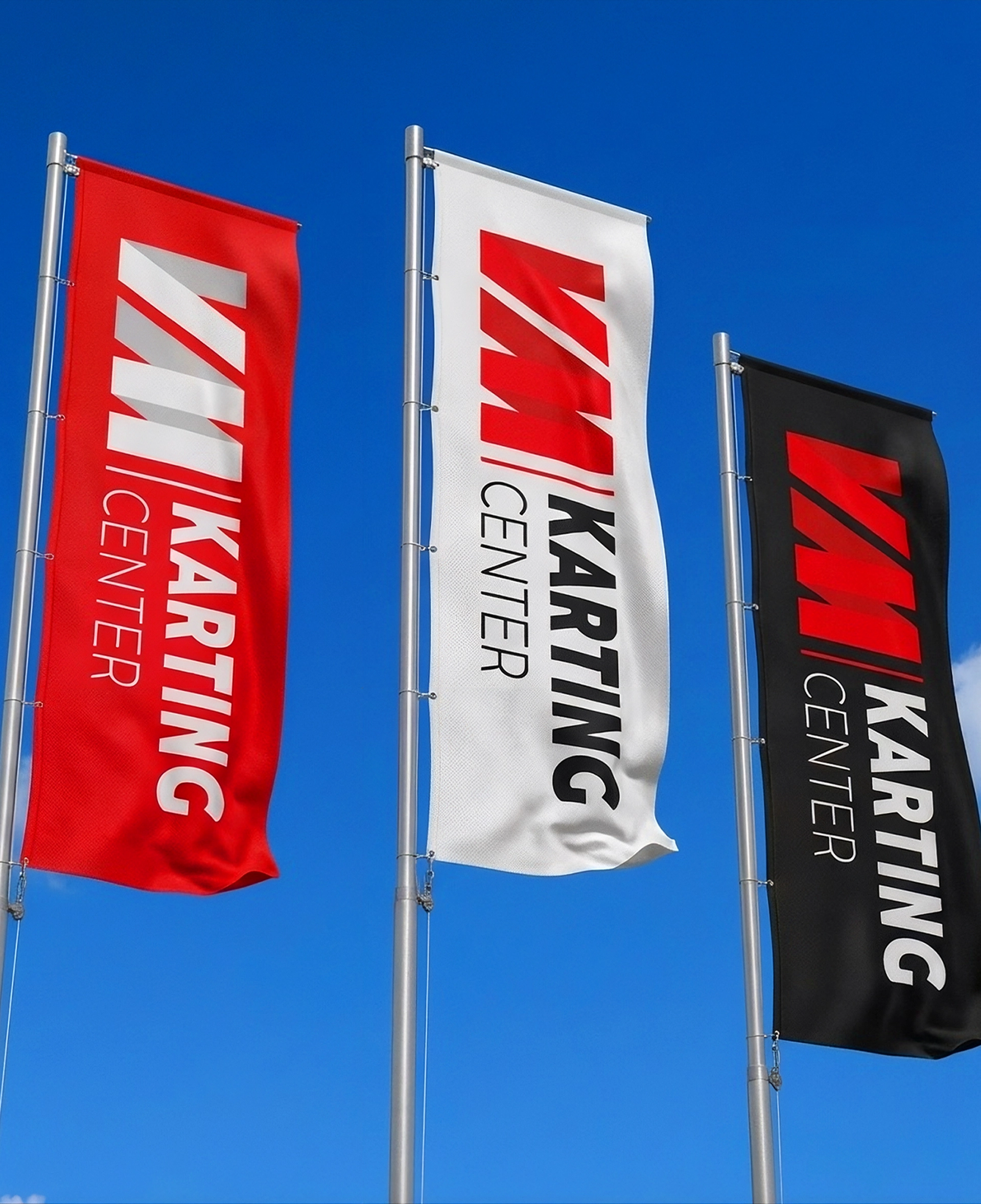
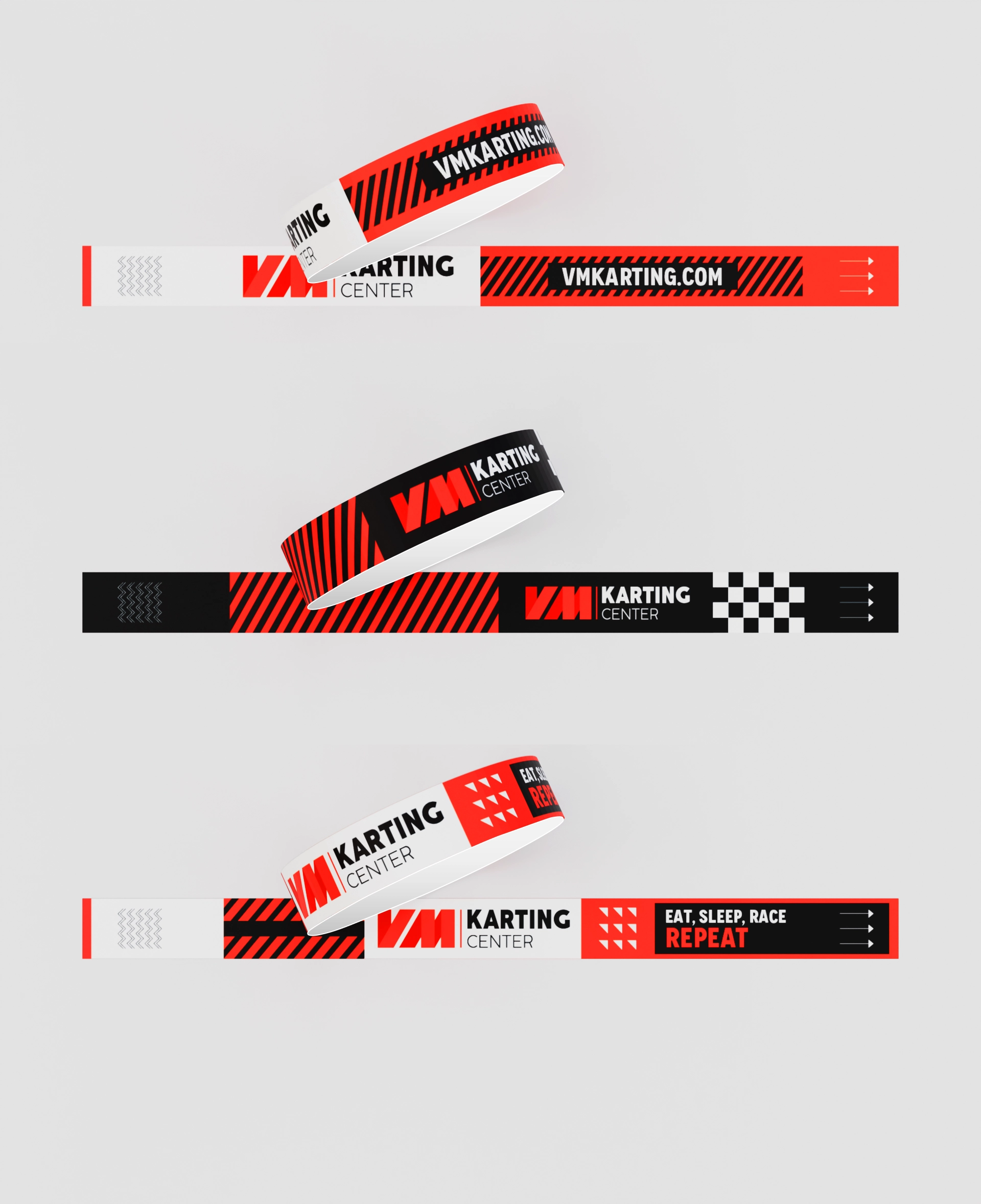
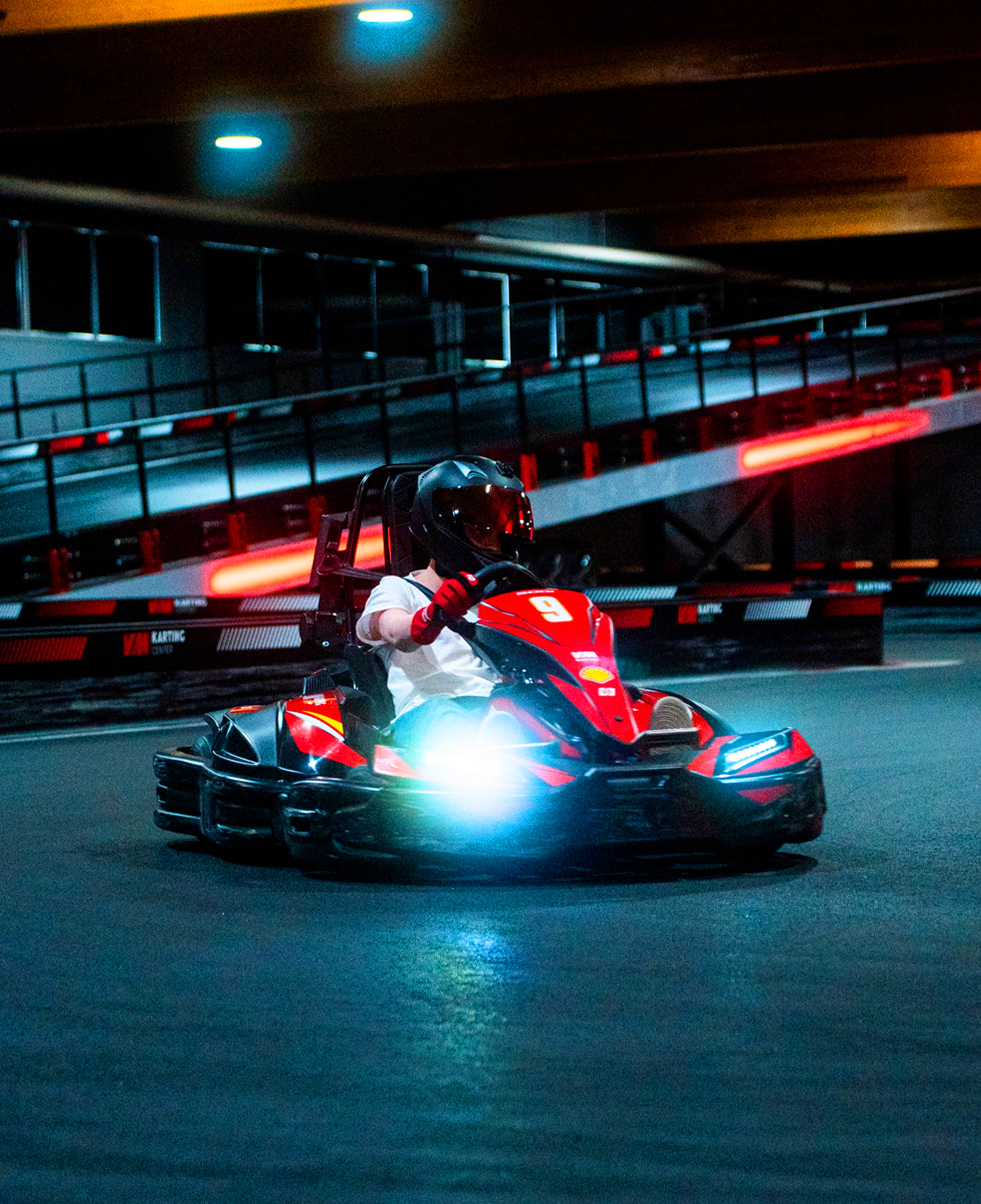
Karting is speed, adrenaline, and precision — the brand had to feel like all three. This identity was built from the ground up to carry that energy across the track, the merchandise, and every touchpoint in between.

Mergero Website
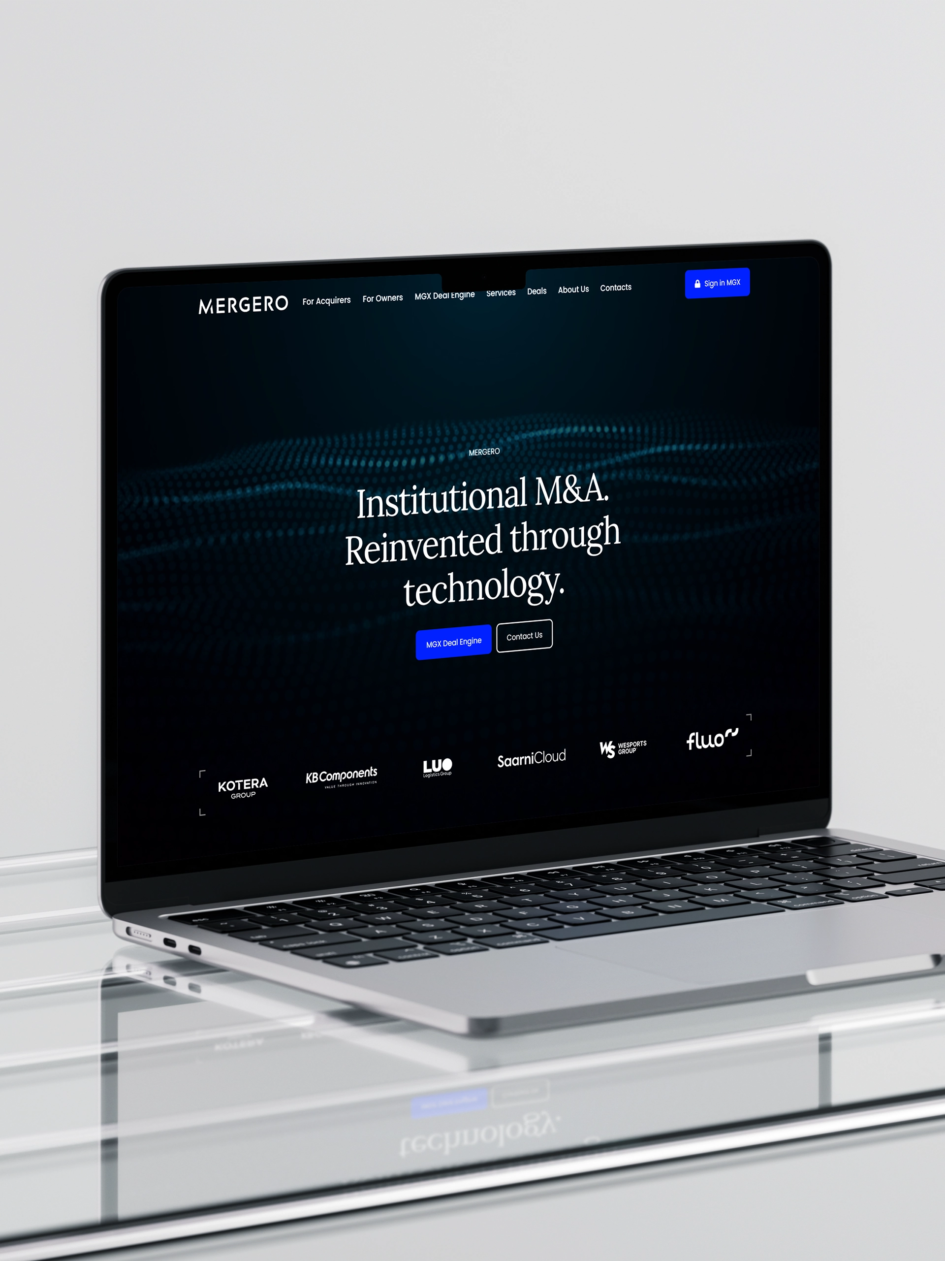
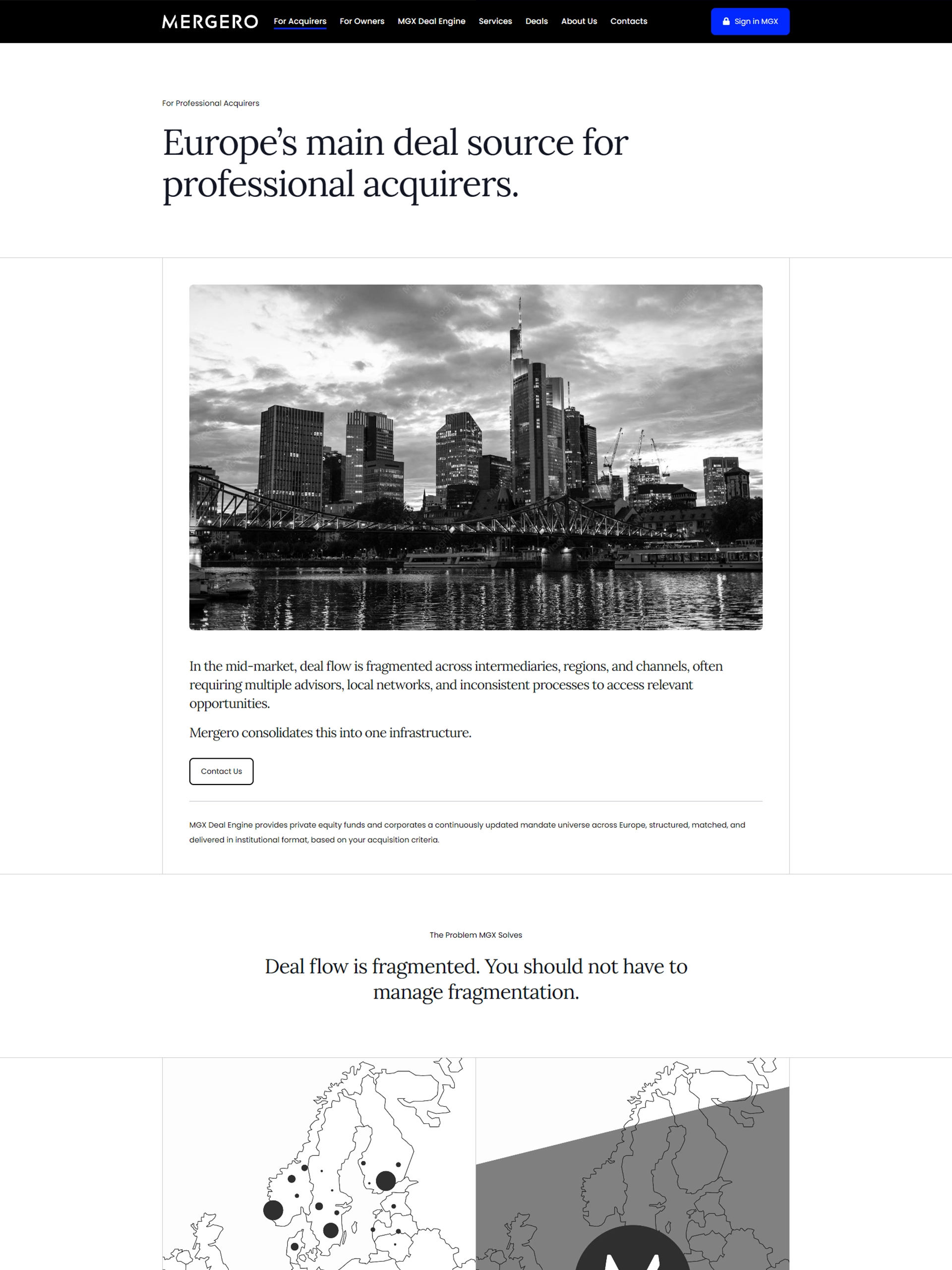
Not every project needs a dramatic brief — sometimes it's about listening carefully and building exactly what's needed. This site was shaped around the client's actual business, prioritizing clarity and usability over noise.
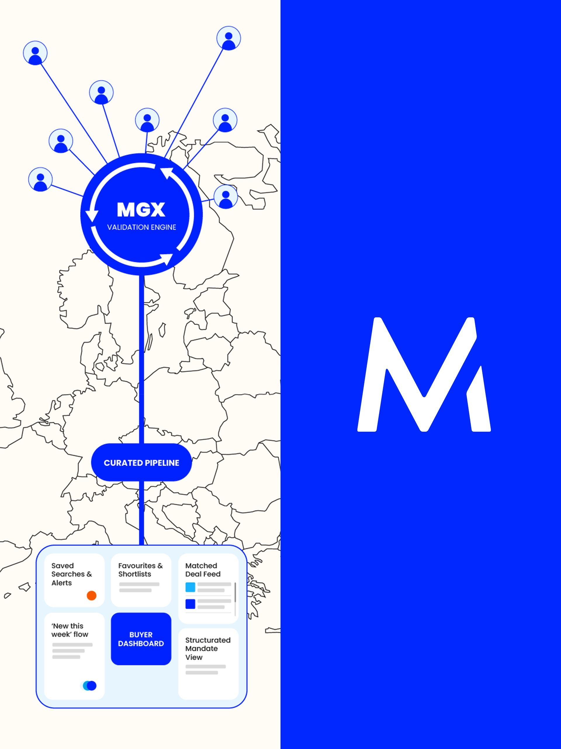

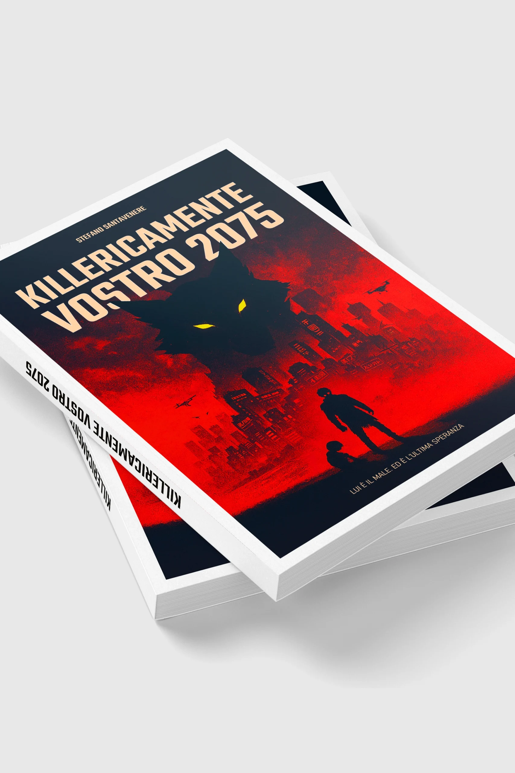
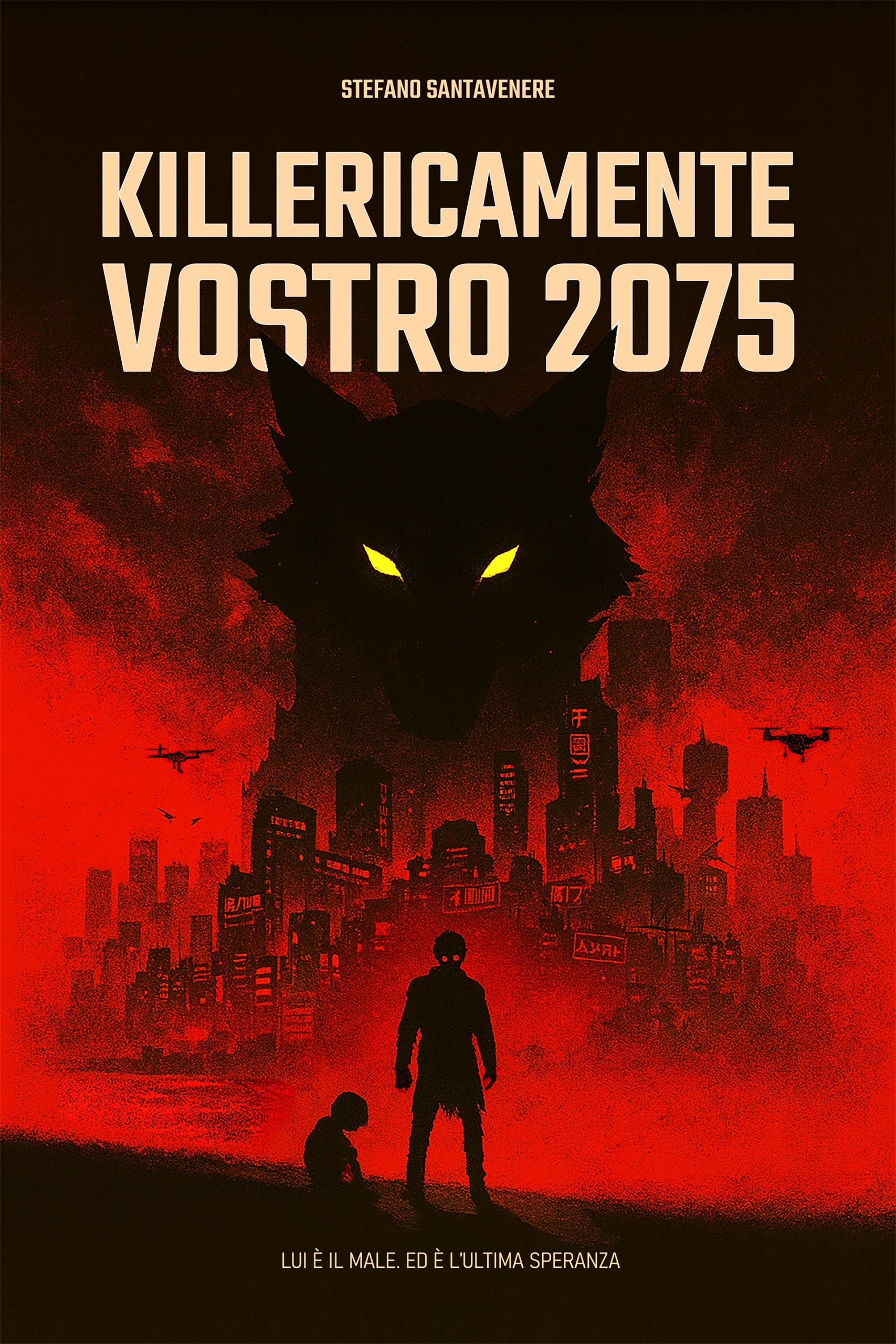
KV Illustration & Cover
A single image asked to do a lot of work: set a tone, hold attention, summarize an idea at a glance. This key visual was built with that pressure in mind — concept-first, then refined until it earned its place on the cover.
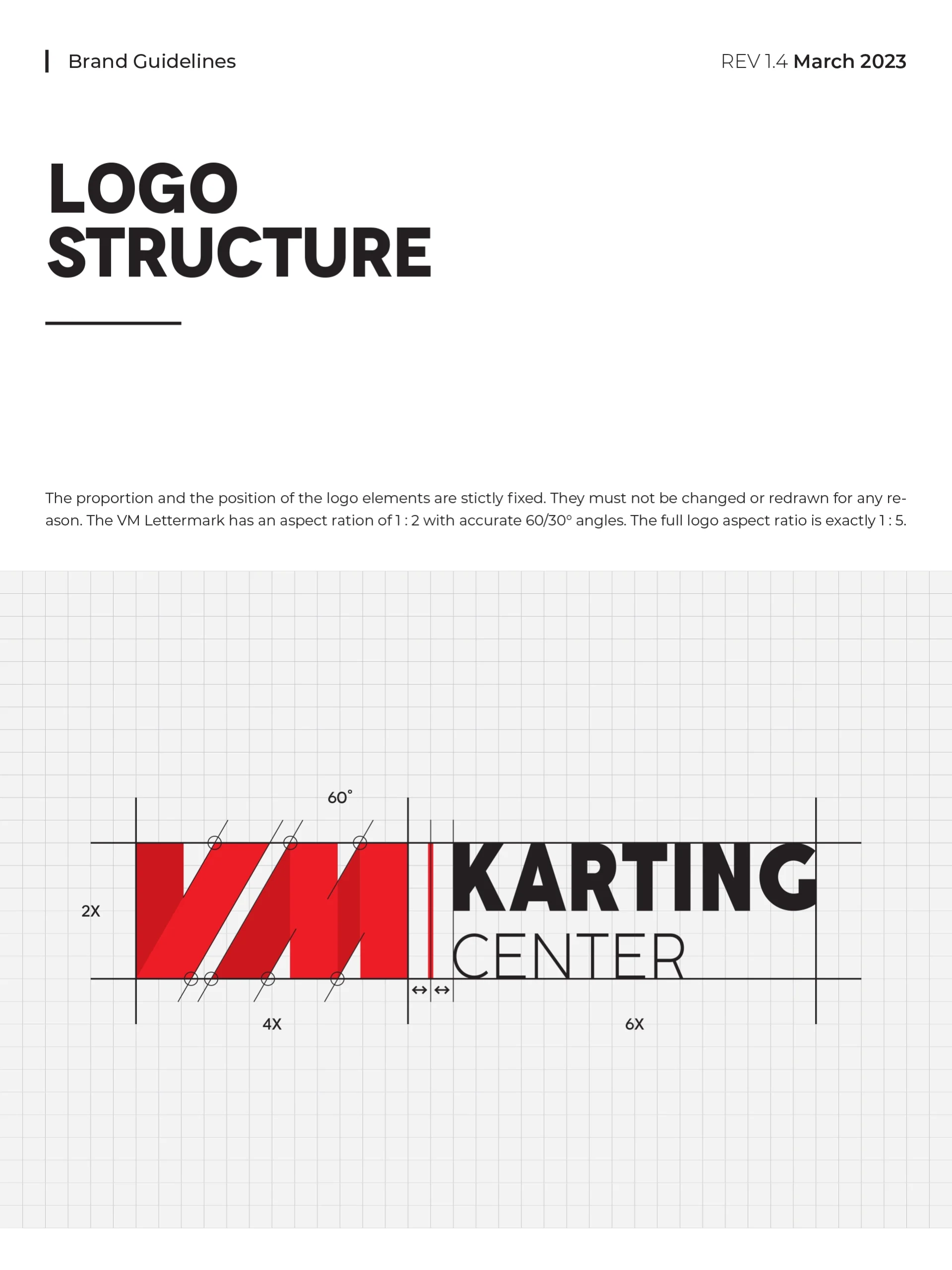
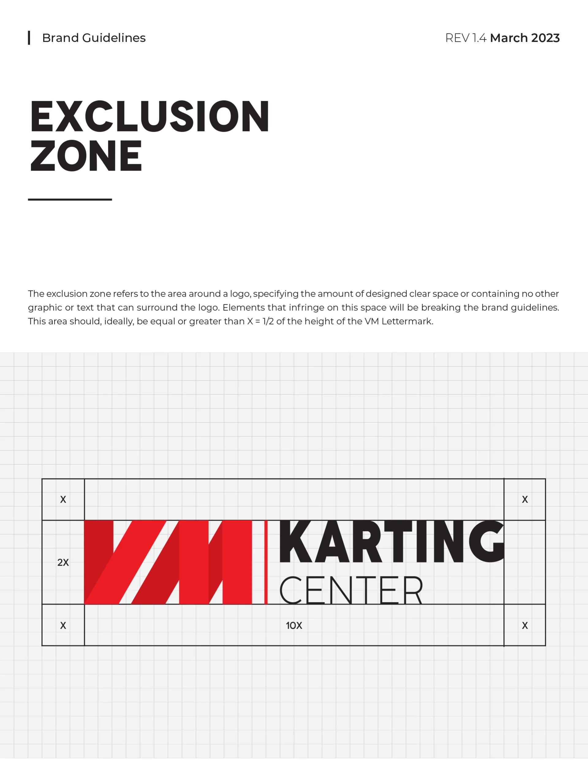
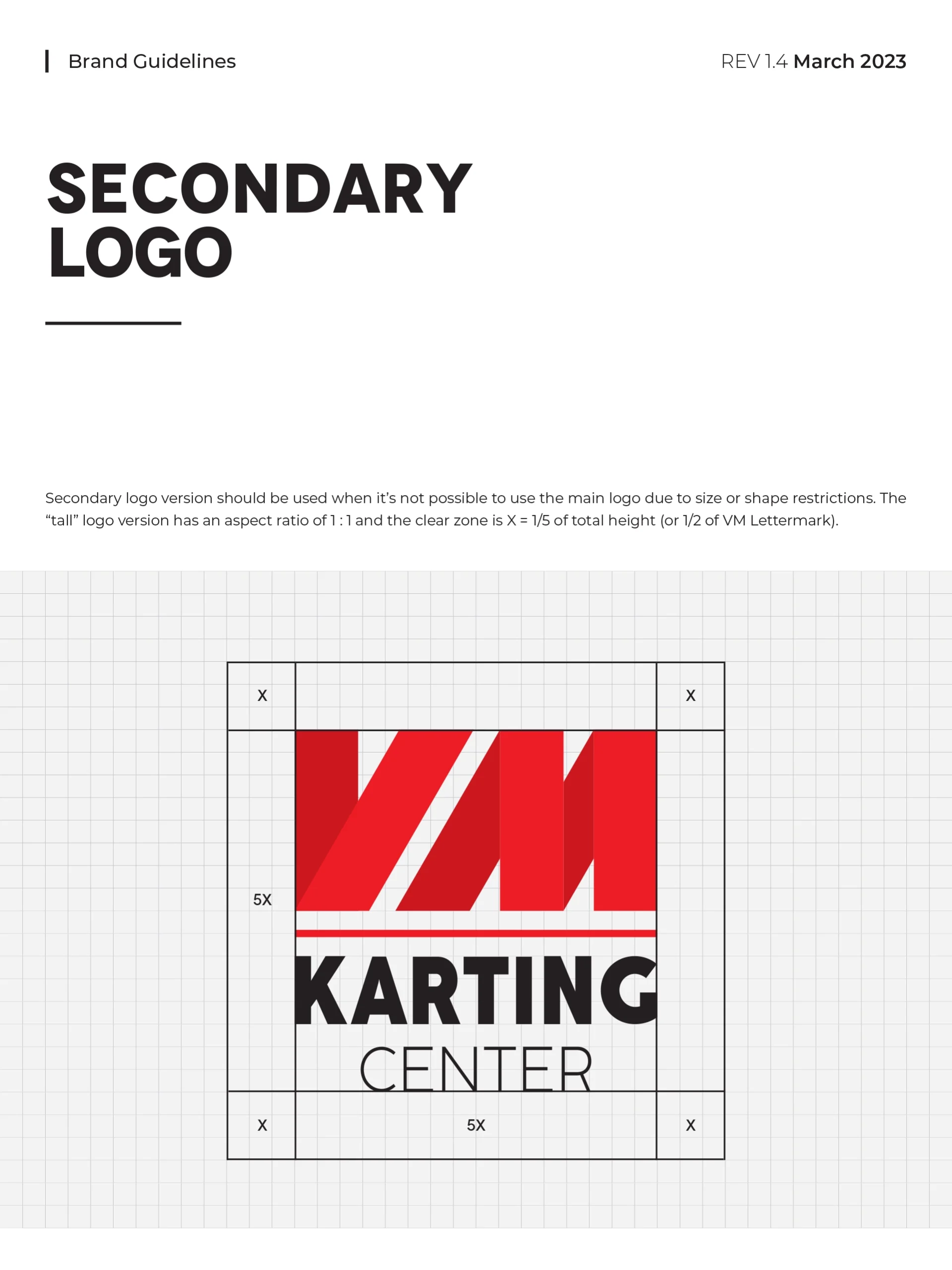
VMKC Logo
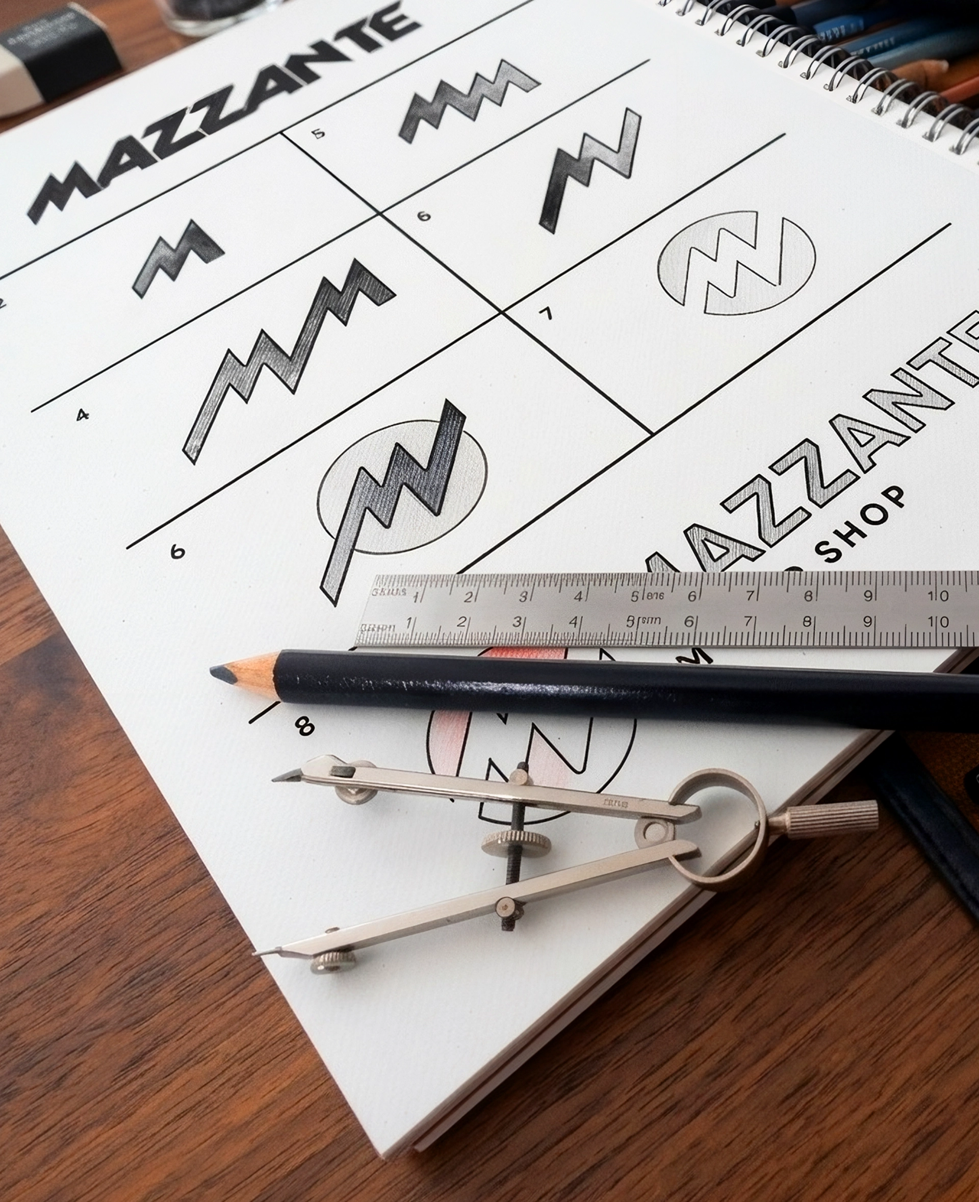
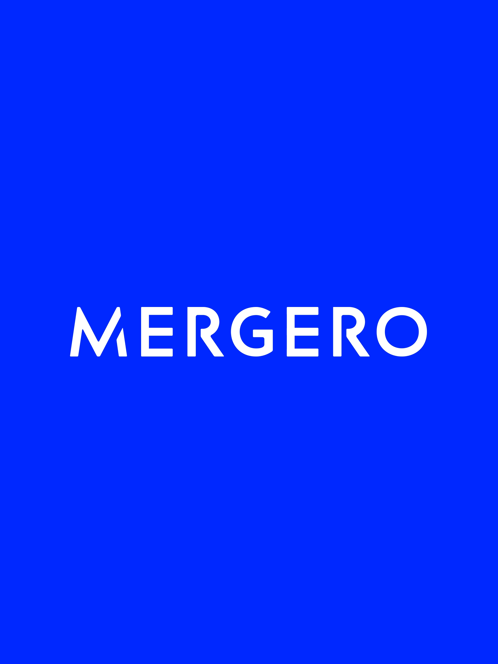
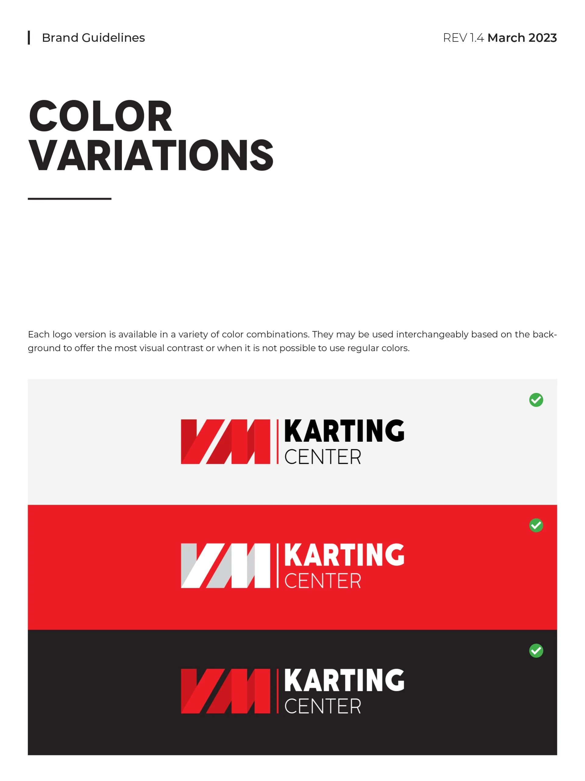
Before the branding, there was the mark. Designed to hold up at speed — on a helmet, a jersey, a track banner — this logo had to be instantly readable and unmistakably VM Karting Center, in any size and any context.
Laplandia Vodka
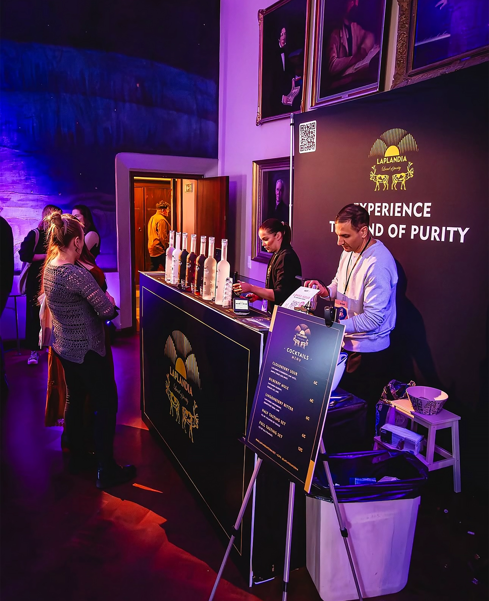
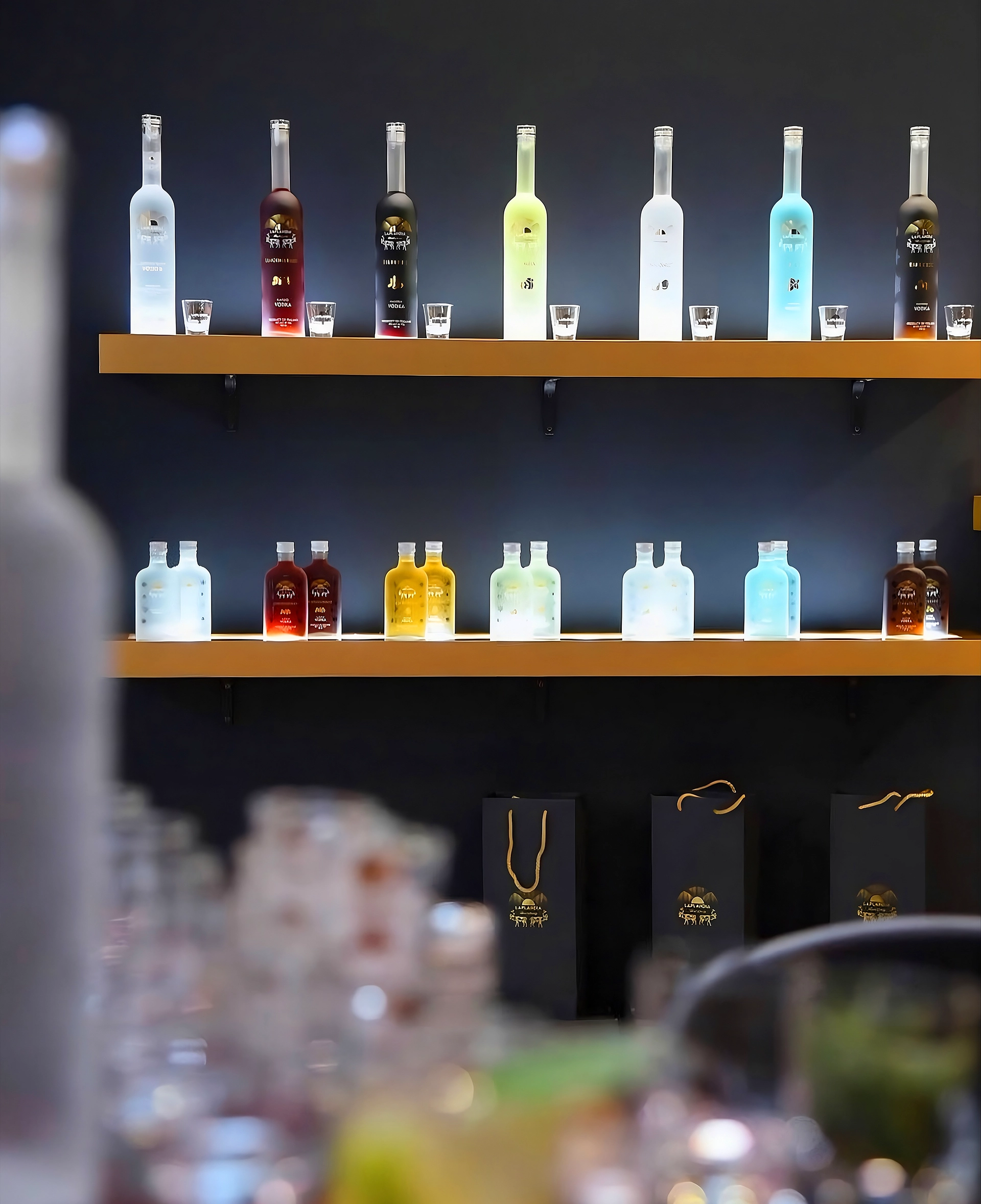
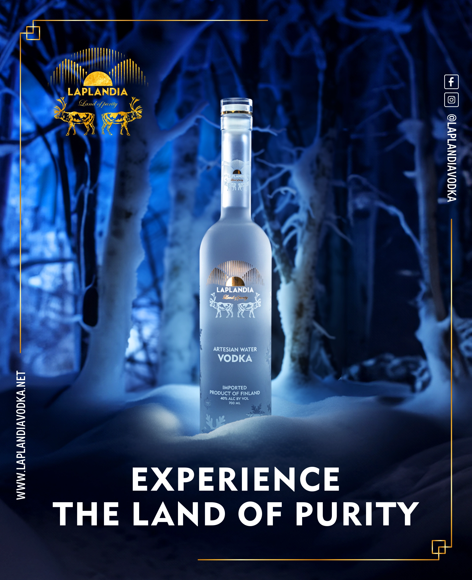
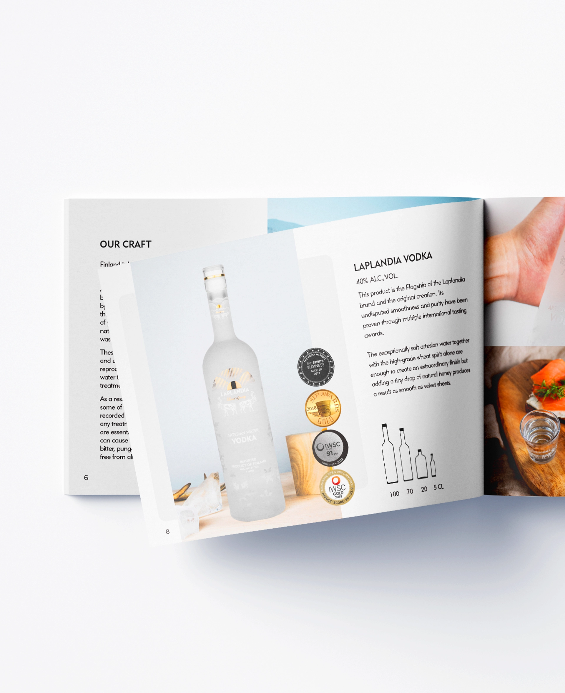
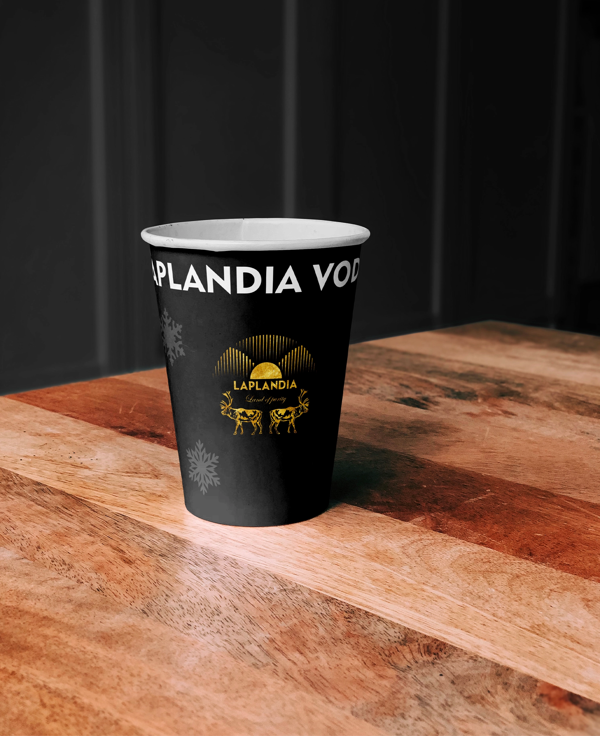
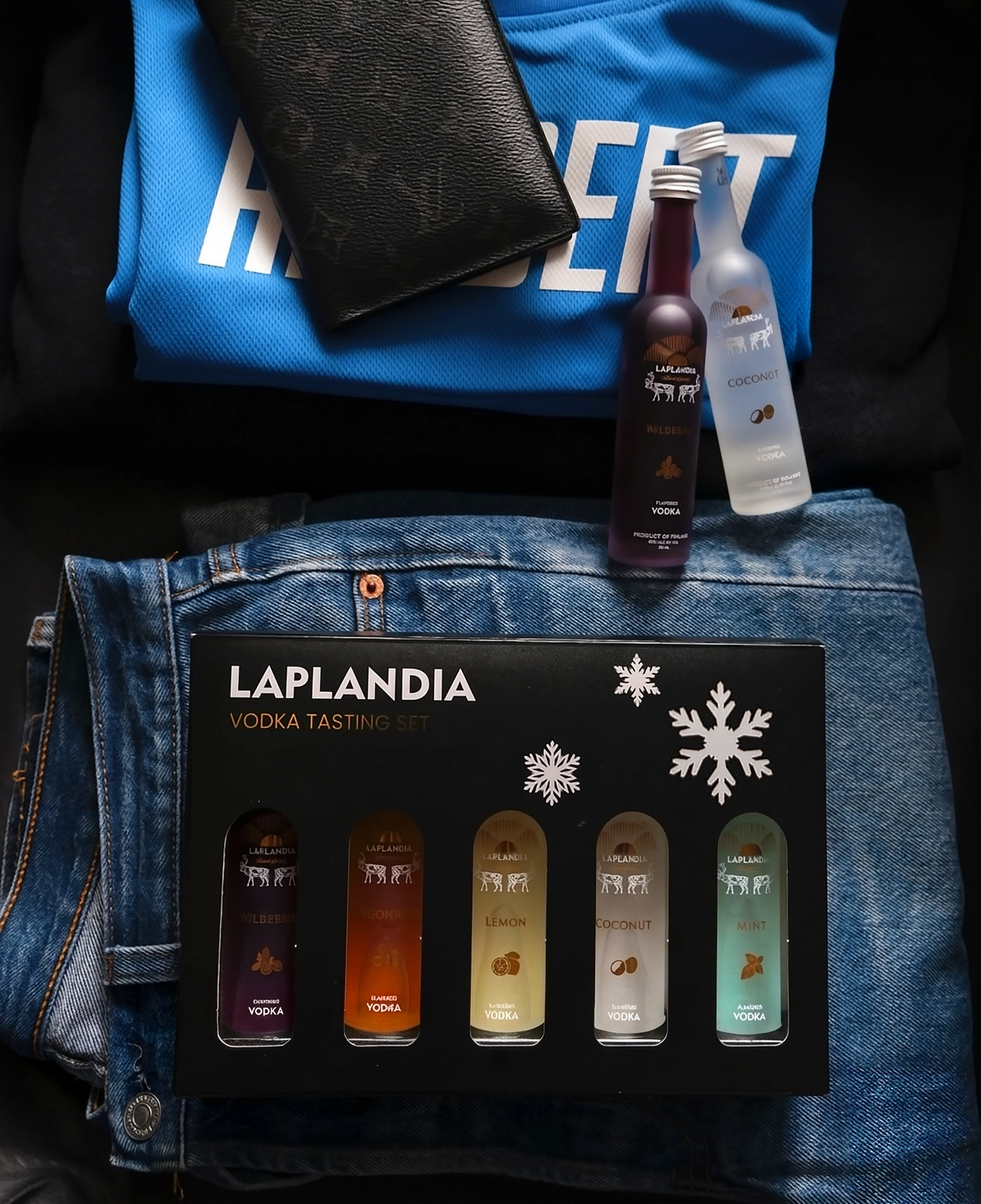
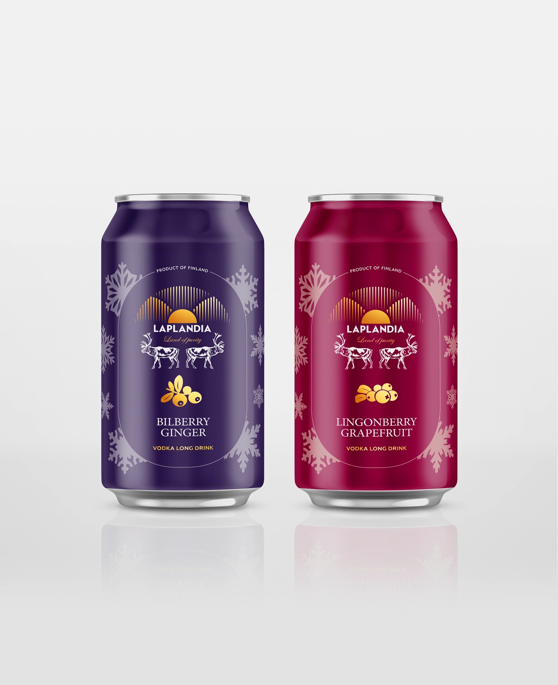
Premium spirits live and die on the shelf in seconds. The packaging design for Laplandia Vodka was built around that moment — a confident, minimal presence engineered to stand out without shouting.

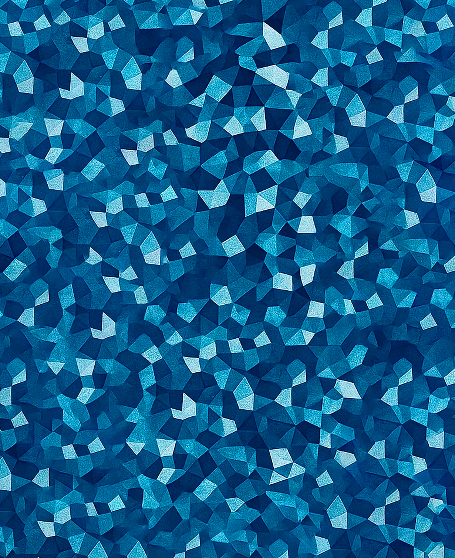
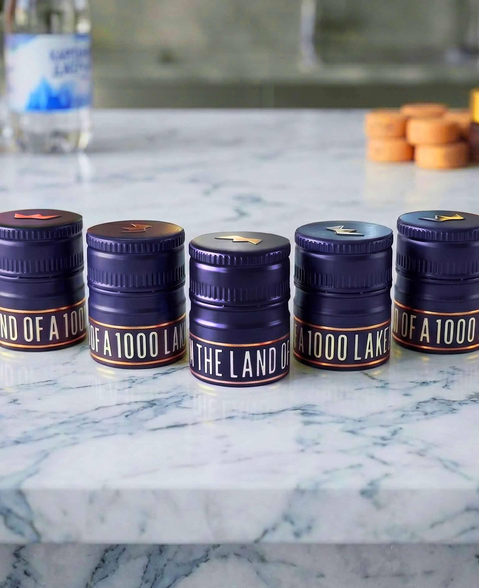
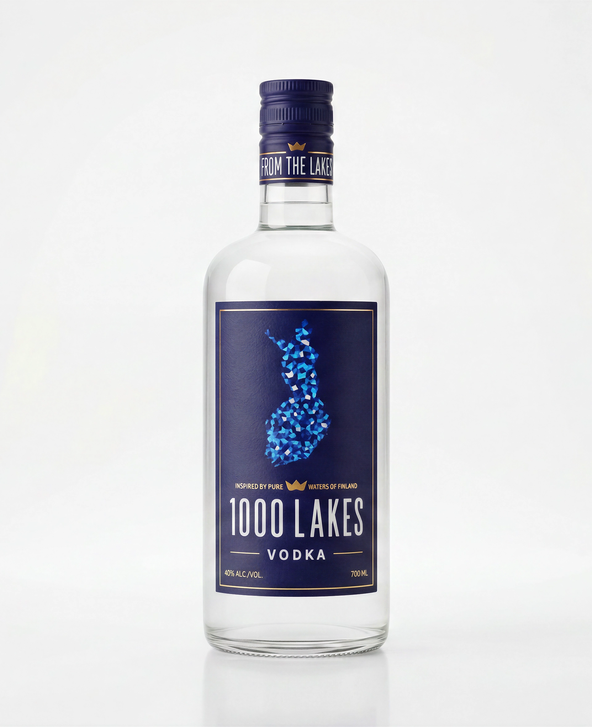
1000 Lakes Bottle design
Named after Finland's landscape, this bottle design draws directly from it — cool tones, simple geometry, a quiet nod to water and stillness. The goal was a shape and label that felt as Finnish as the name itself.

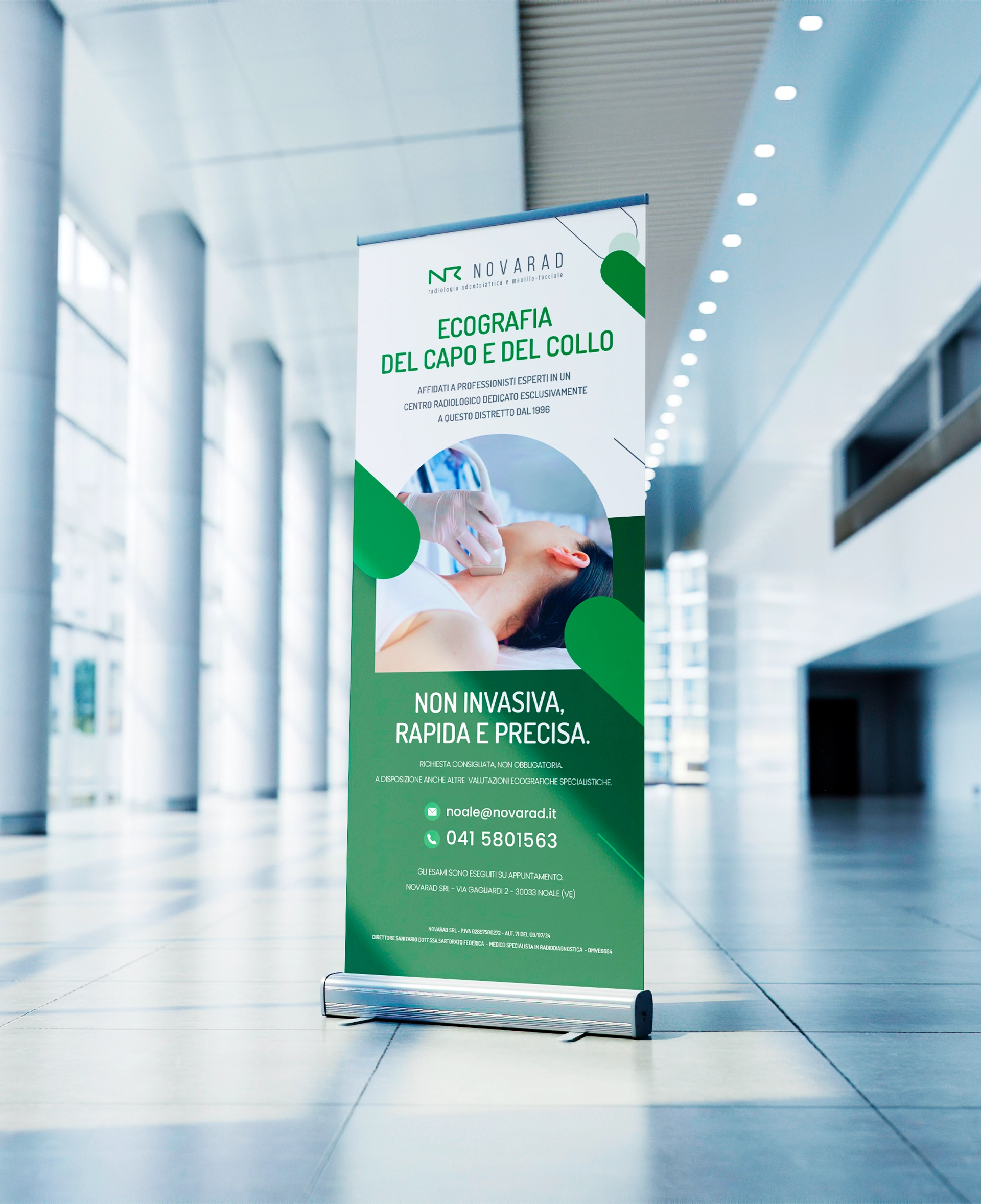
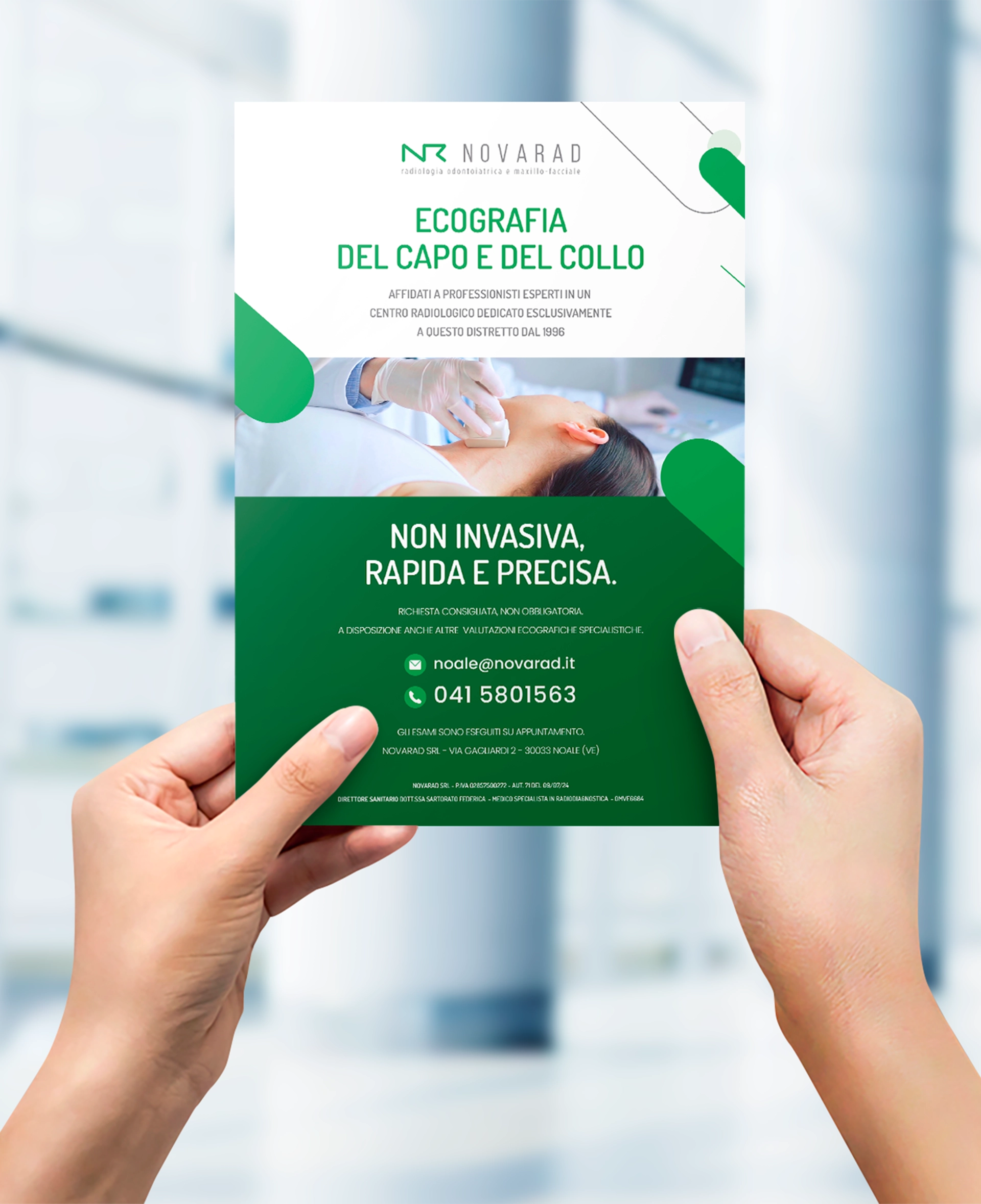
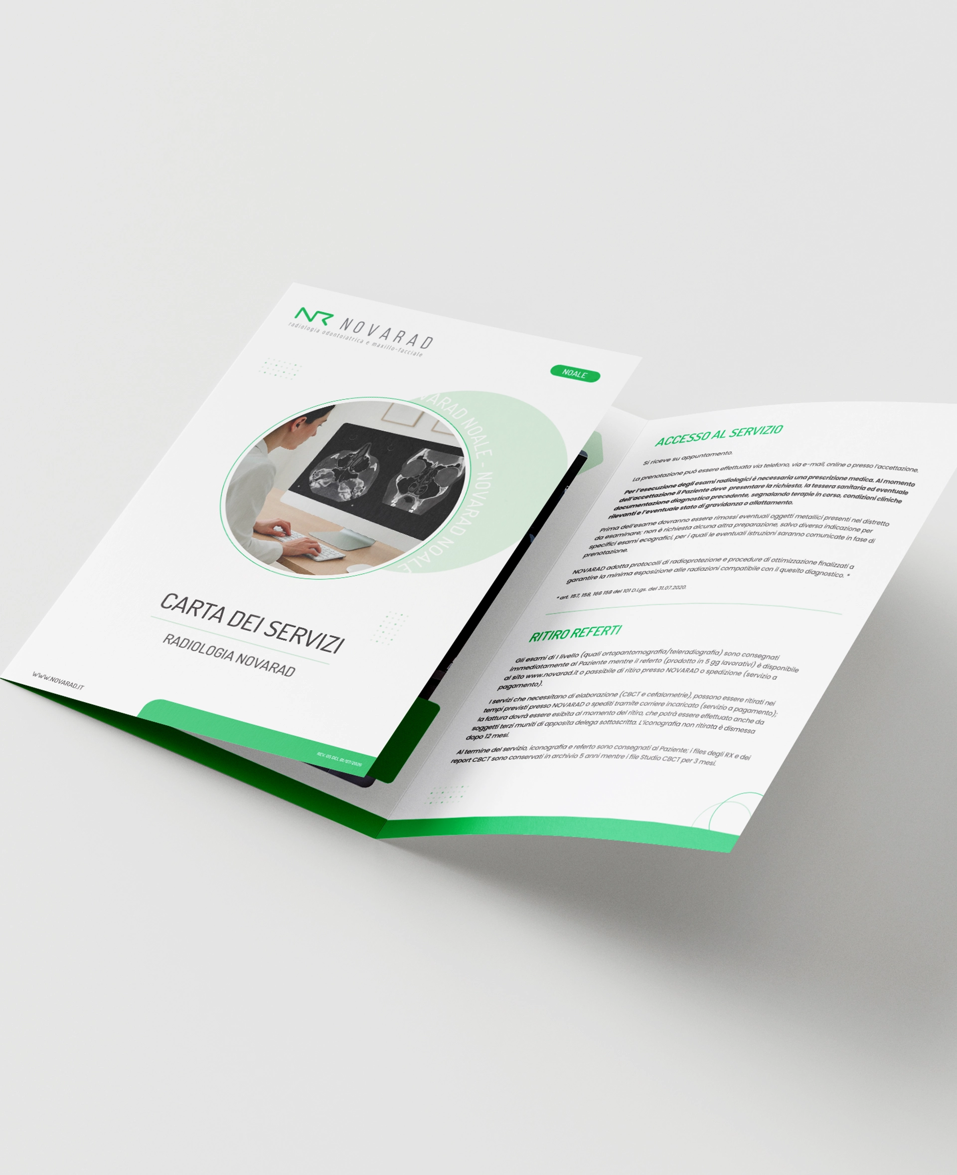
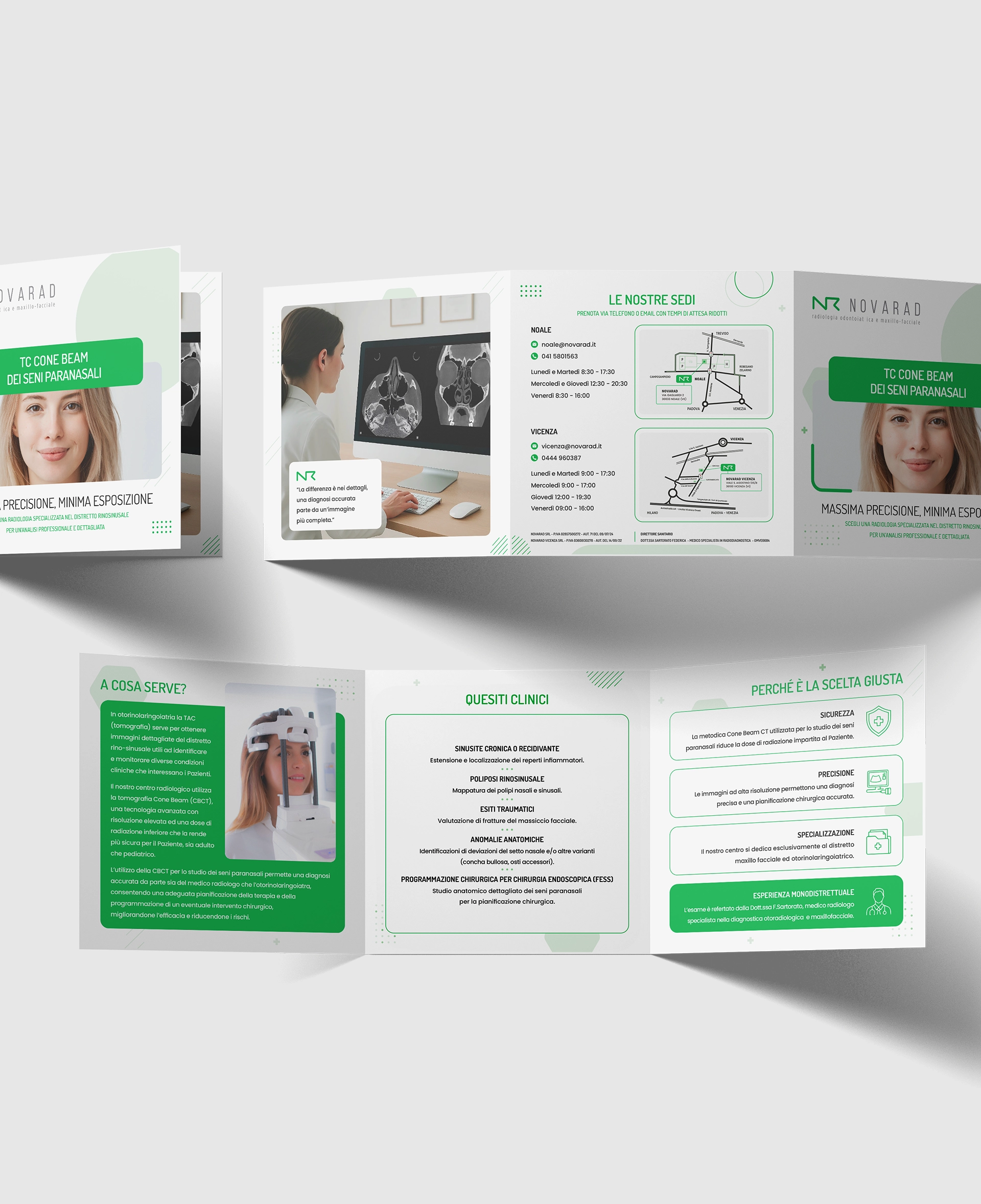
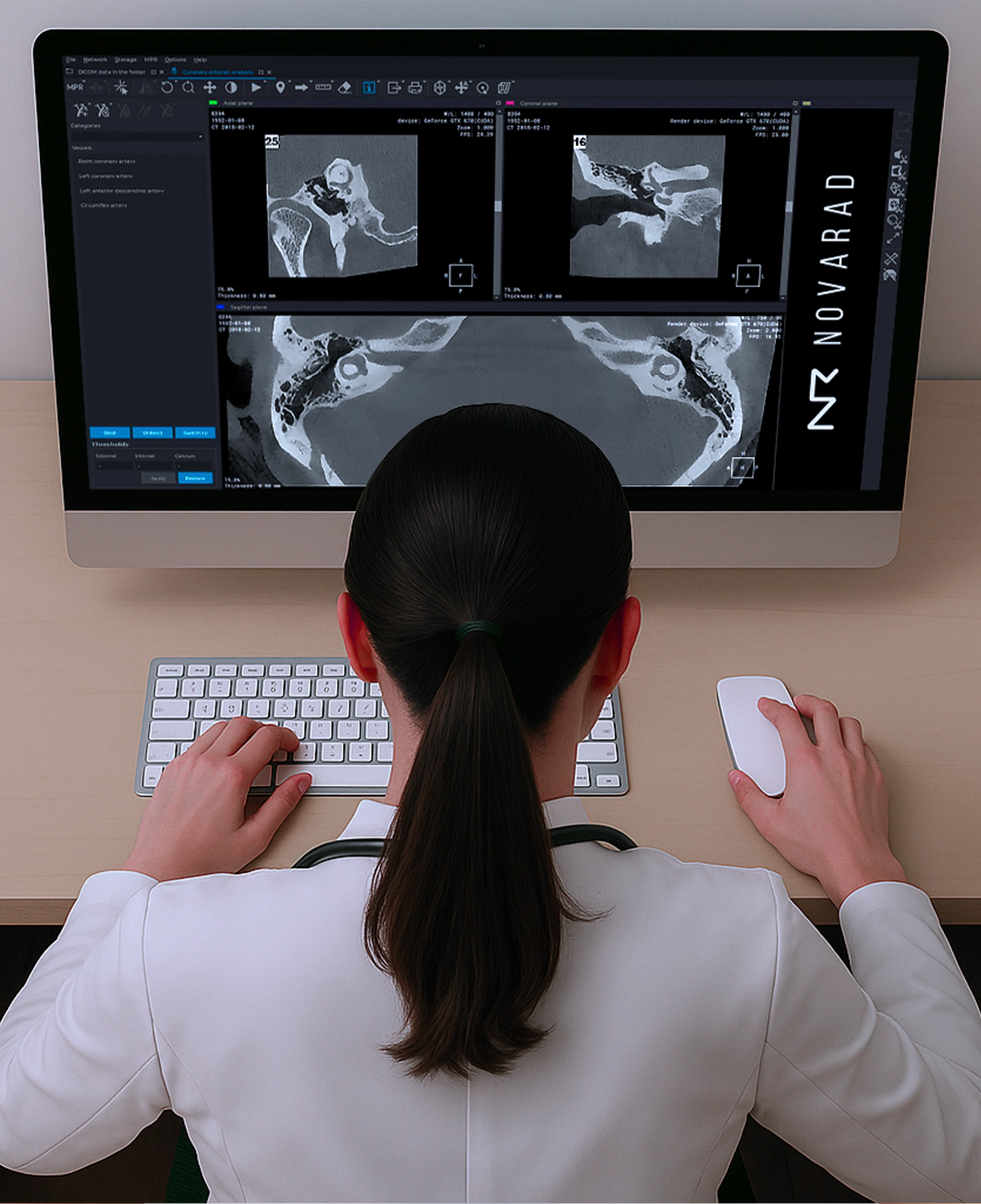
Novarad S.r.l. Print Material
Institutional print work for a diagnostic imaging center comes with its own discipline: precision, trust, and zero room for ambiguity. Every piece was produced to reflect that — clear, consistent, and quietly professional.
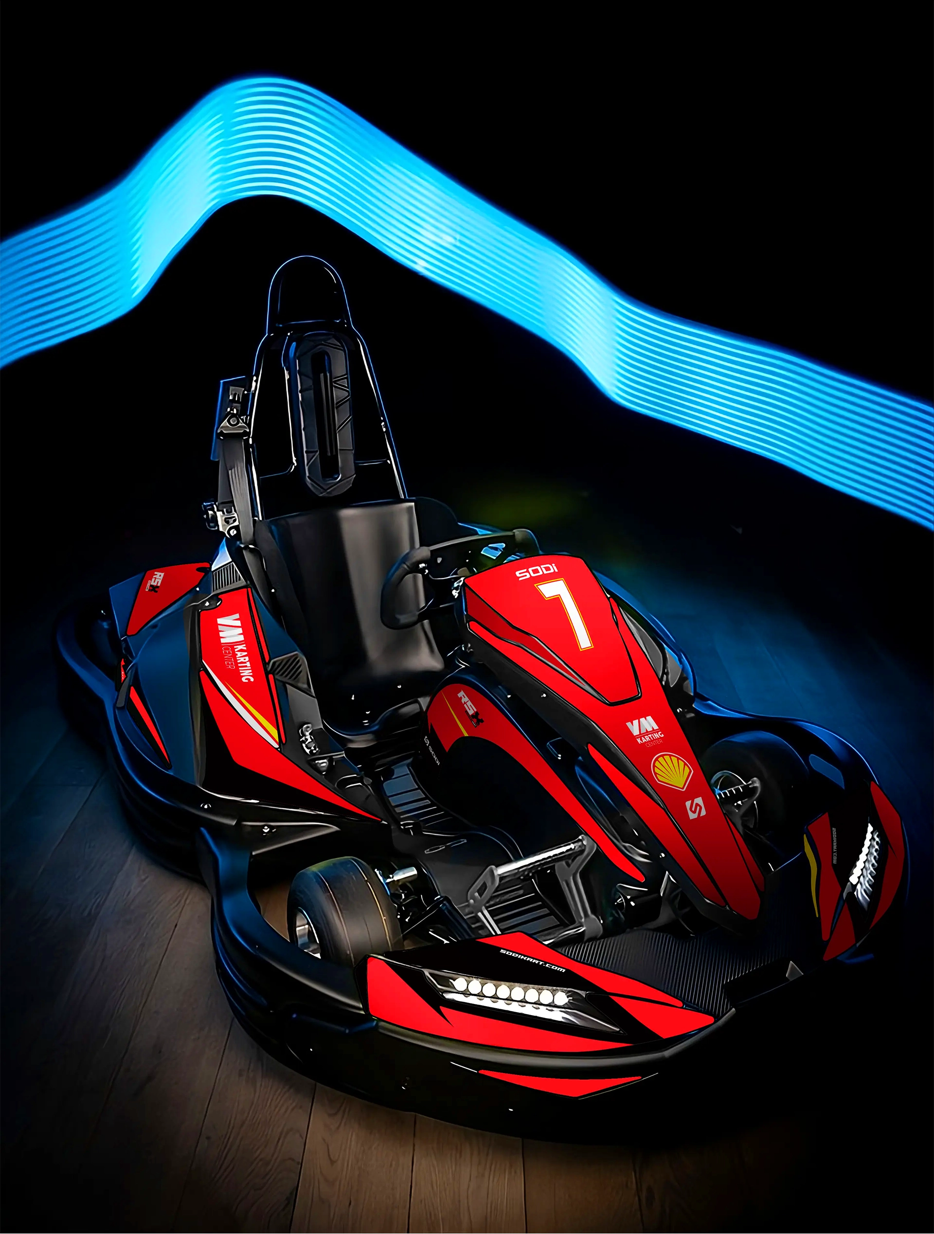
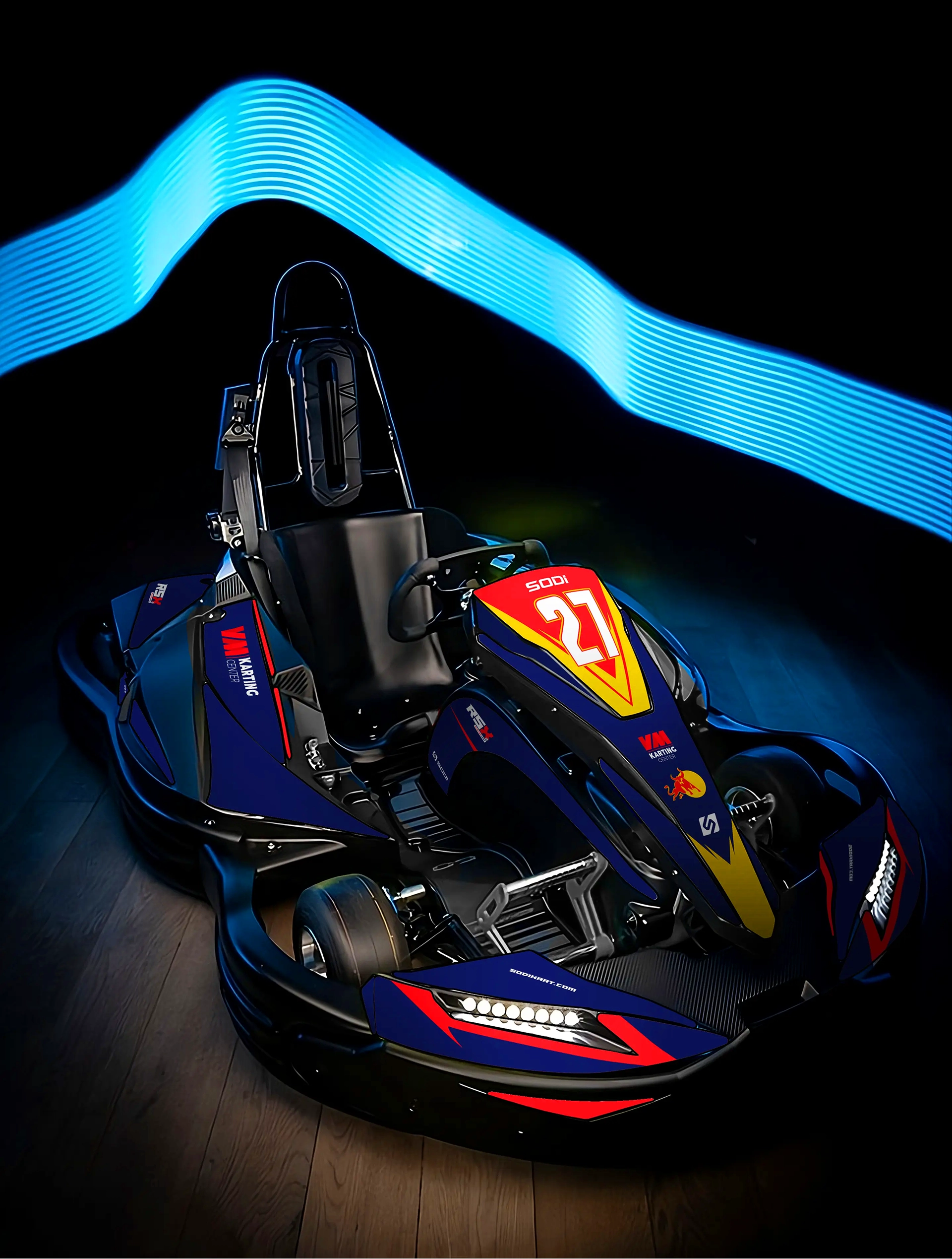
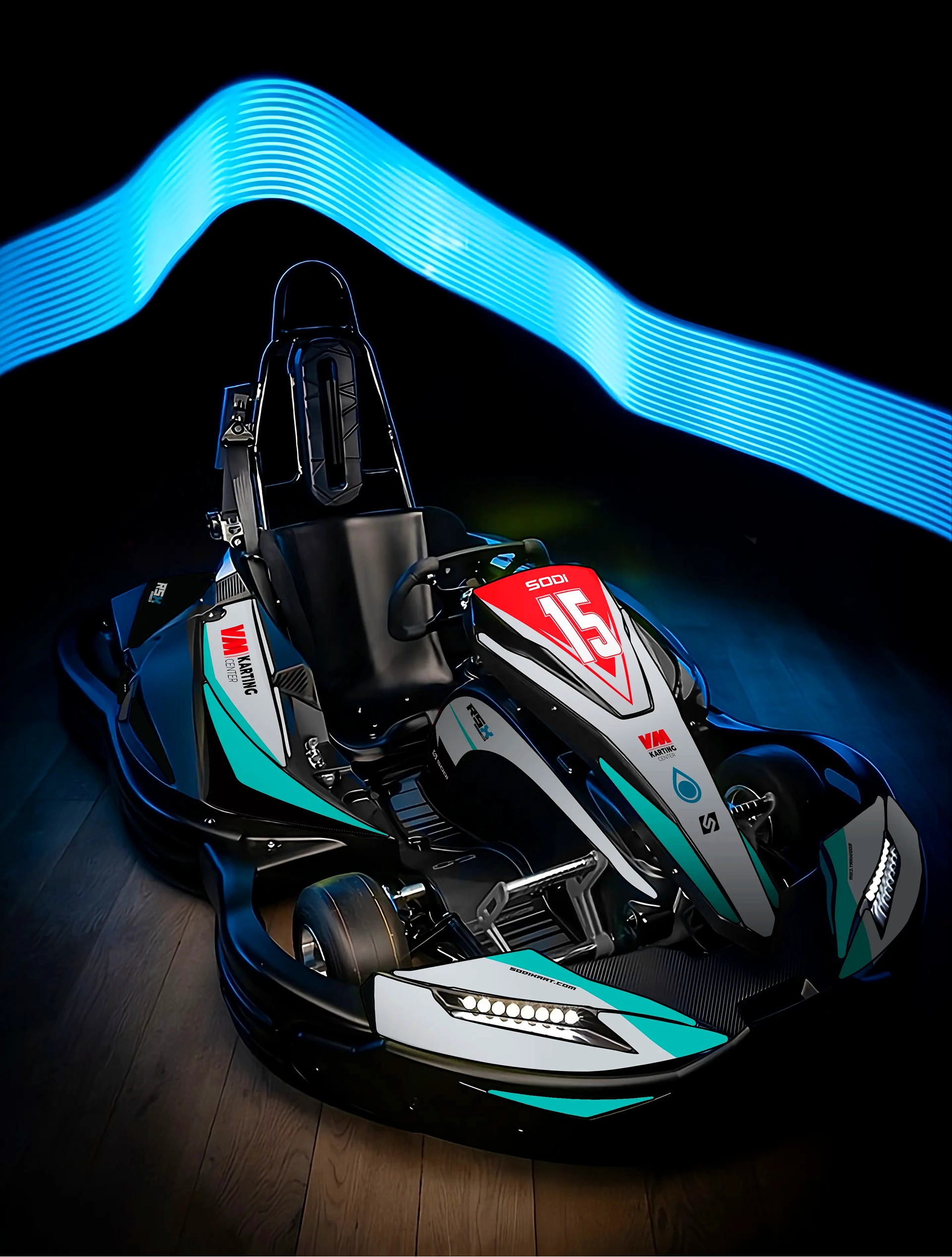
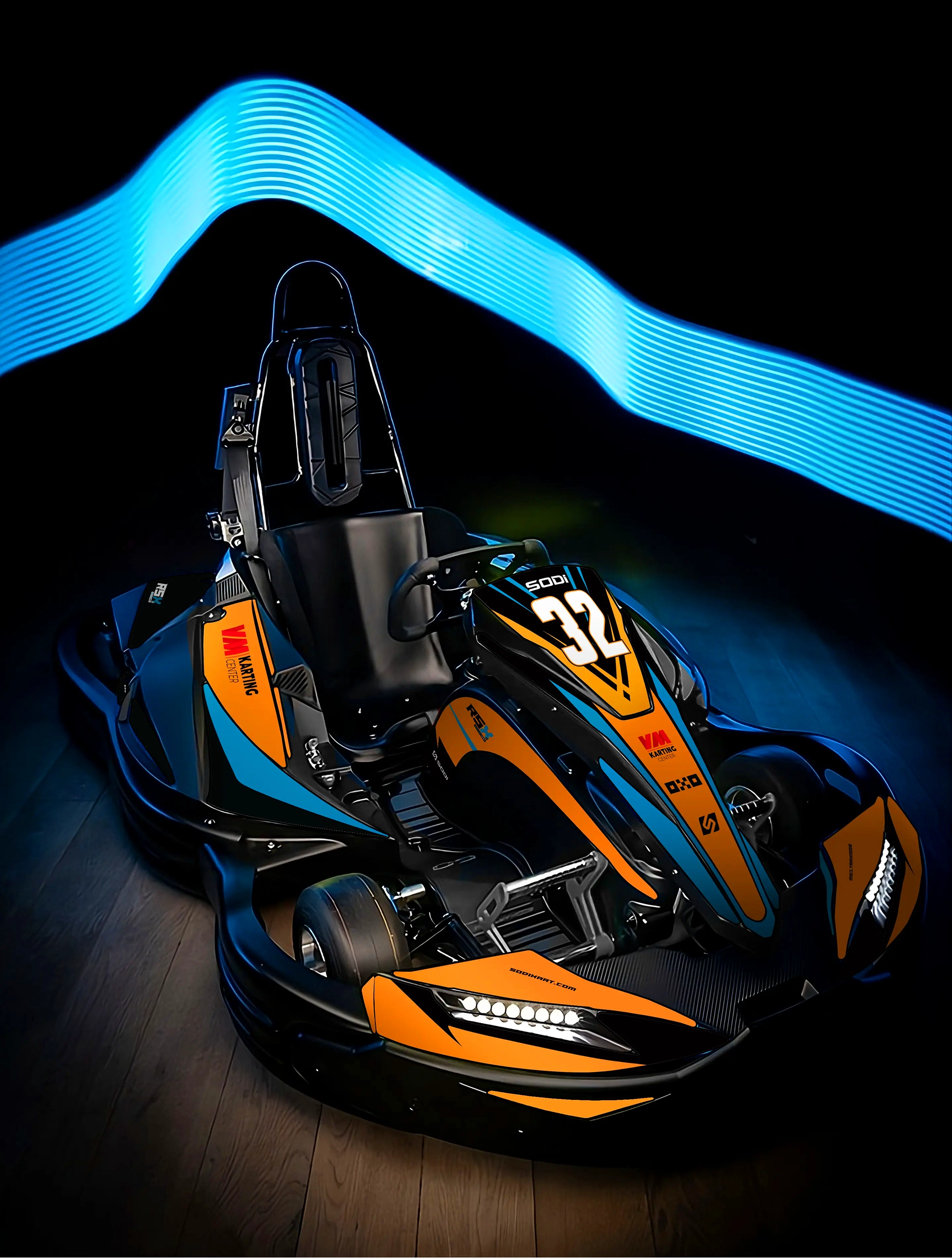
VMKC Kart Design
Every kart in the fleet needed its own identity without losing the one the brand already has. Each livery plays with a different colour scheme and number, so riders can be told apart at a glance — while staying unmistakably VM Karting Center.